Digital marketing agency
- About Project
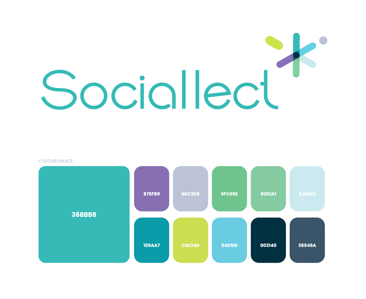
The Sociallect logo is built around a simple idea, multiple inputs, one clear outcome. The icon at the top works like a hub. Each colored arm represents a different part of digital marketing such as content, performance, social, branding, and analytics, all coming together at a single central point. That center is the strategy.
It is not random decoration. The structure shows how everything connects:
Different directions → different channels
Different colors → different functions
One intersection → one unified approach
That is essentially what Sociallect does. It takes scattered efforts and aligns them.
The slight variation in angles gives it a sense of movement, which reflects how digital marketing is always active and evolving. At the same time, everything meets at the center, so it still feels controlled and not chaotic.
Color also plays a role here.
Instead of one flat tone, the mix suggests diversity of services and flexibility, while the main wordmark stays clean and consistent to balance it out.
The typography is intentionally simple.
It does not compete with the icon. It grounds the brand, making sure the identity feels usable across platforms without becoming overly design heavy.
- Client: sdsd
- Category: sdsd
- Role: sdsd