Vama
- About Project
Vama Inverters is a solar energy brand under Goldisolar, built around the idea of smart, reliable power for modern homes and businesses. When they came to us, Vama had a strong product and a clear mission. What they needed was an identity that could carry that conviction visually, something that felt as forward-thinking as the technology behind it.
The Design Challenge
The solar energy space is growing fast, and with that growth comes a lot of noise. Most brands in the segment default to generic green palettes and recycled symbols. Vama needed to stand apart. The identity had to communicate innovation and reliability at the same time, technical enough to earn trust, approachable enough to connect with everyday buyers considering solar for the first time.
The Solution
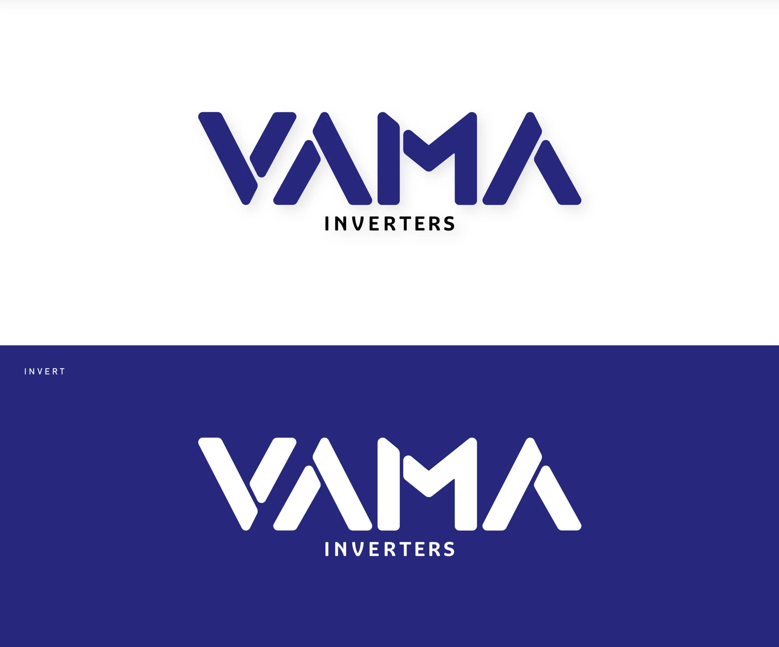
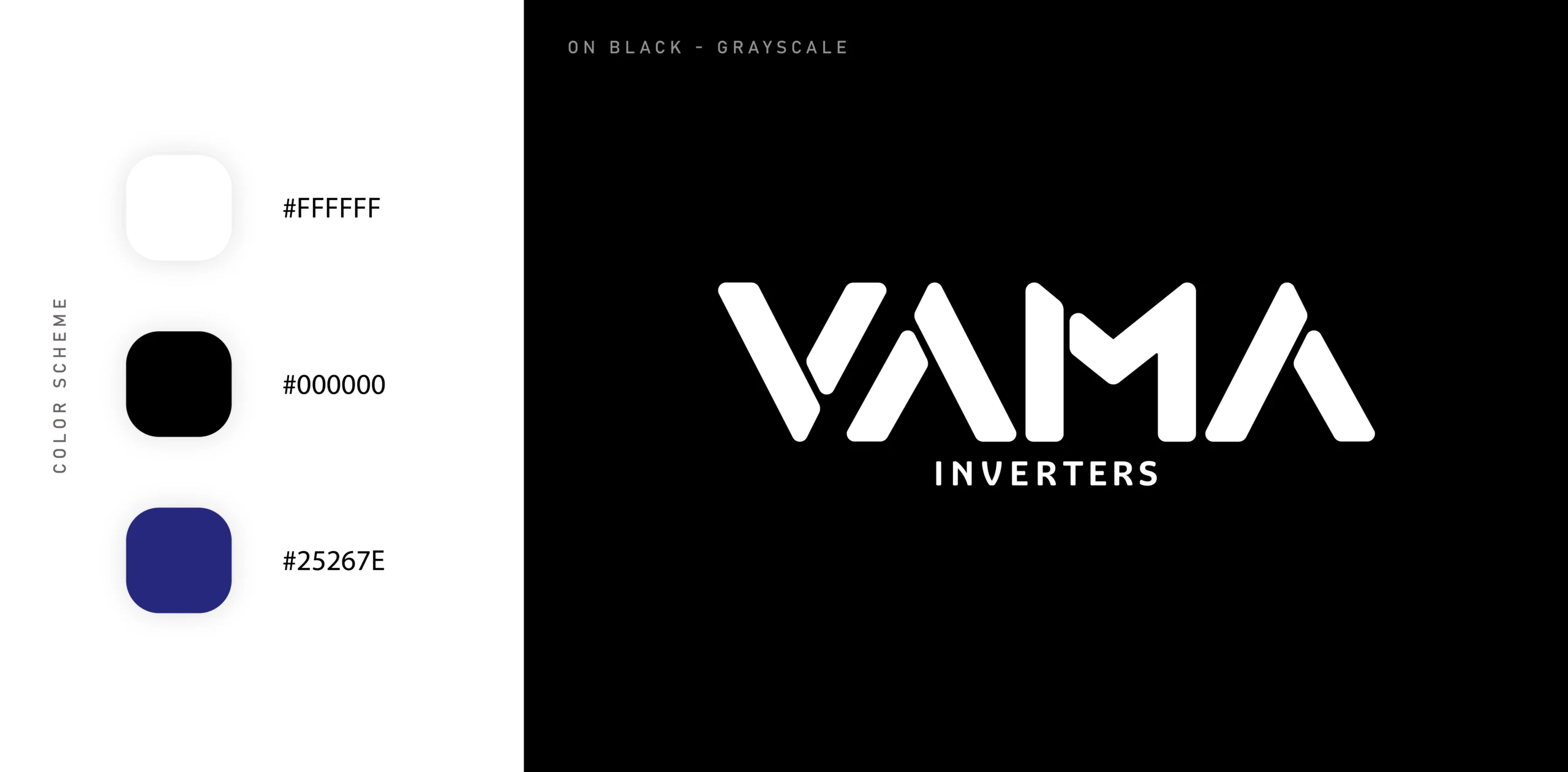
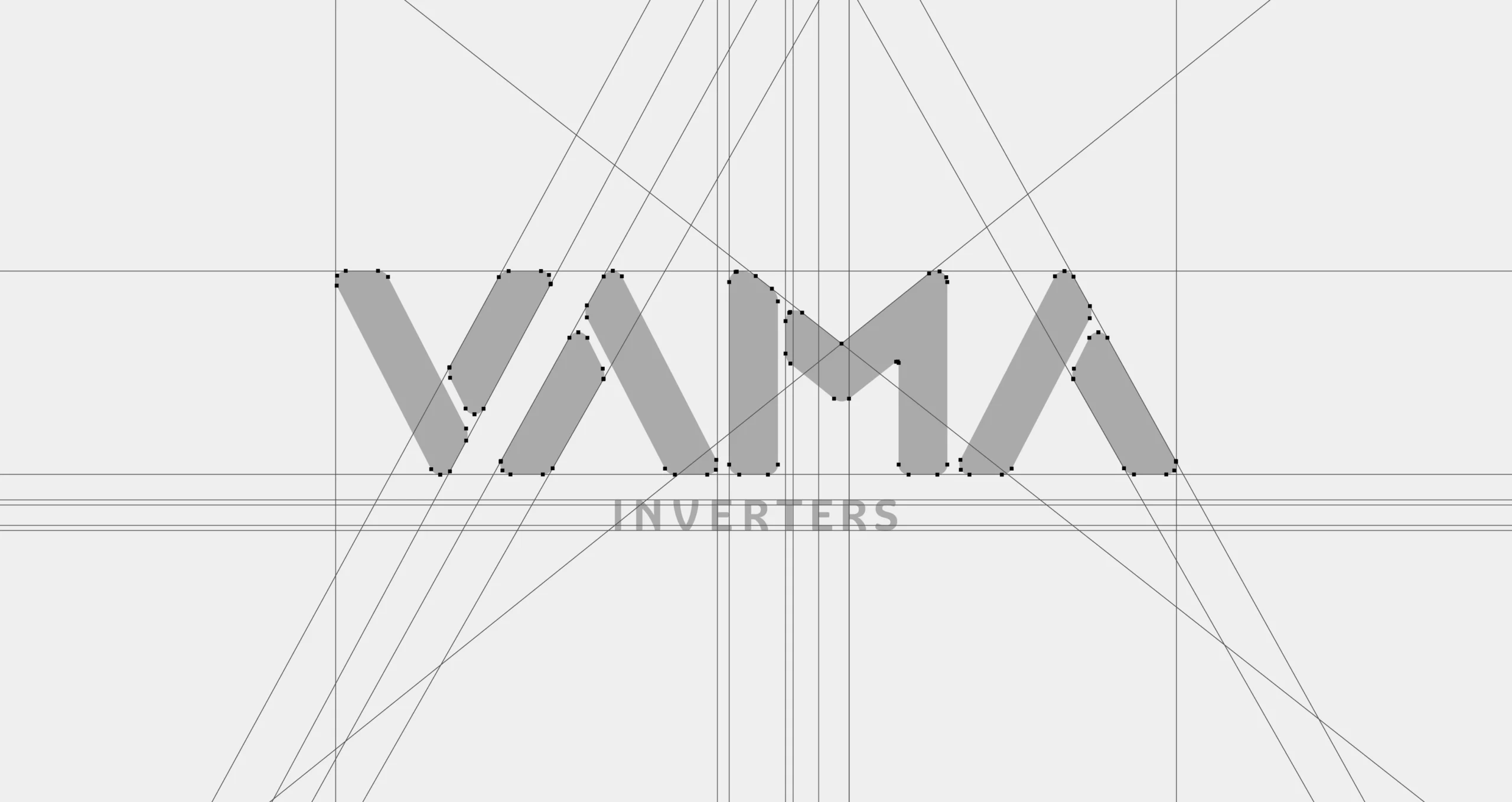
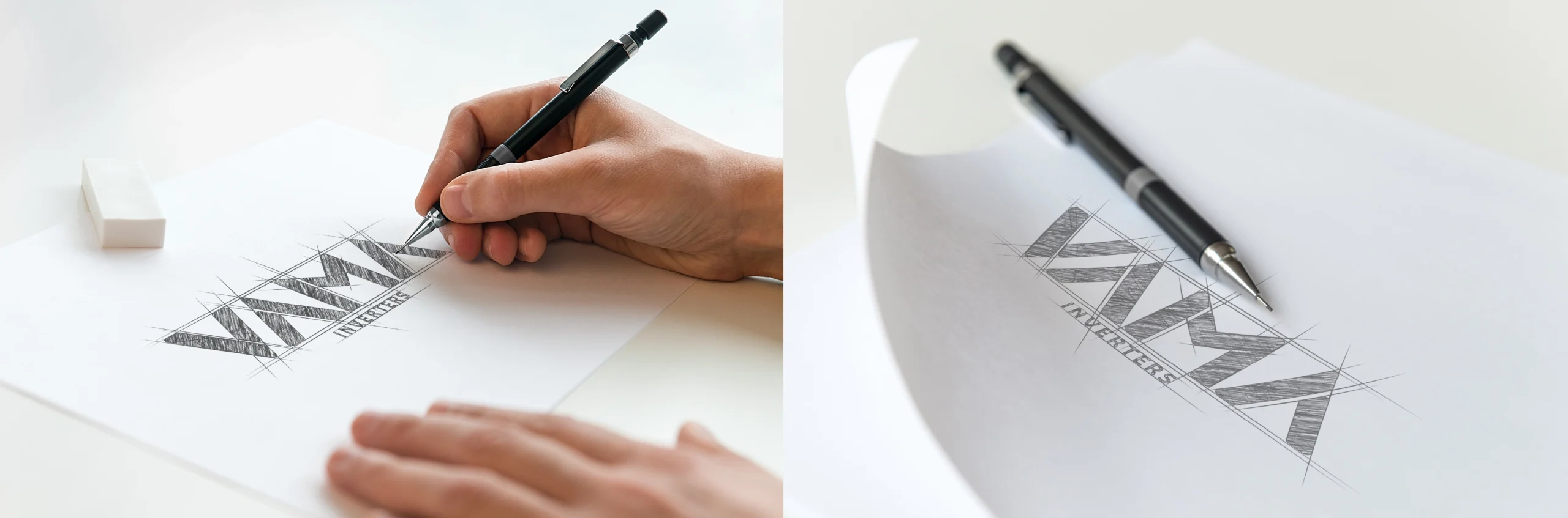
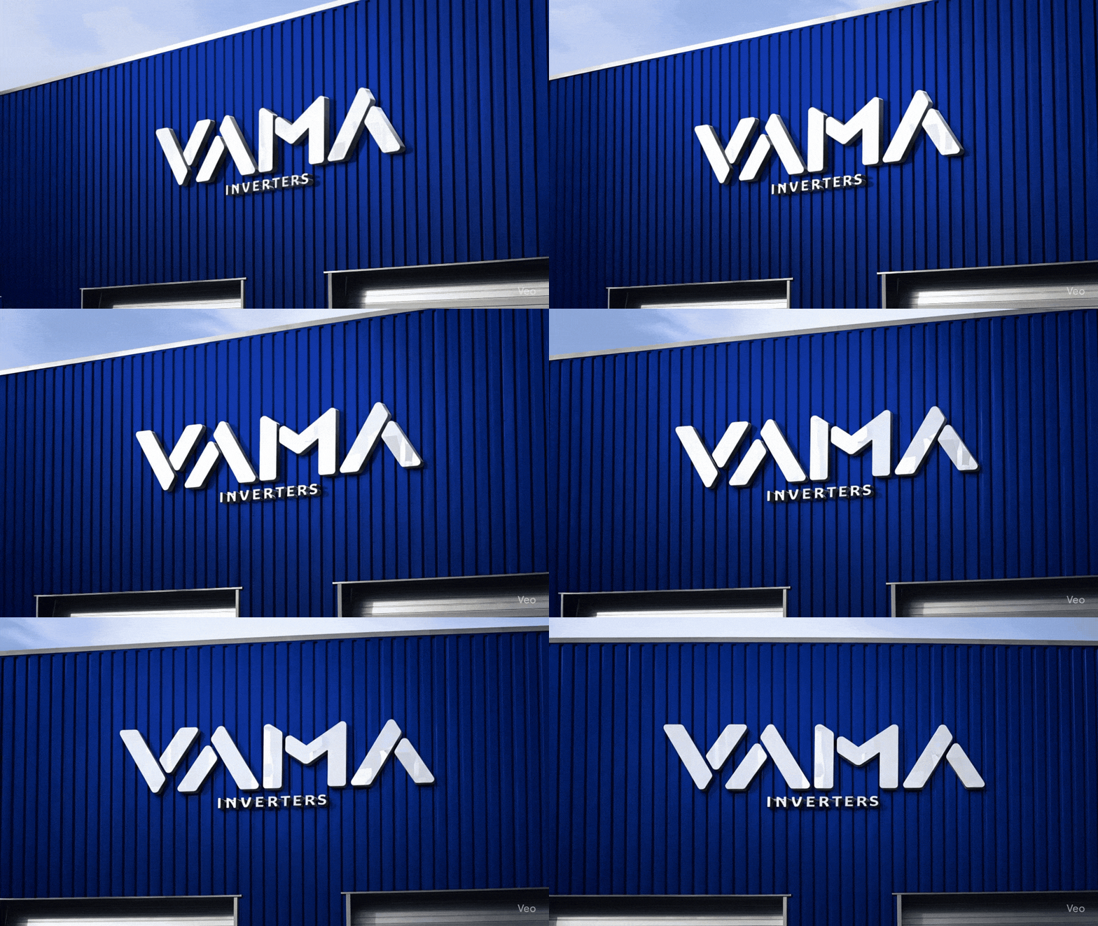
The Logo: The mark was built around bold, geometric forms that suggest energy, movement, and precision. Sharp angles and clean symmetry were not decorative choices. They were deliberate signals of a brand that knows exactly what it stands for. The deep blue tone was chosen to convey clarity and strength over the overused greens of the category.
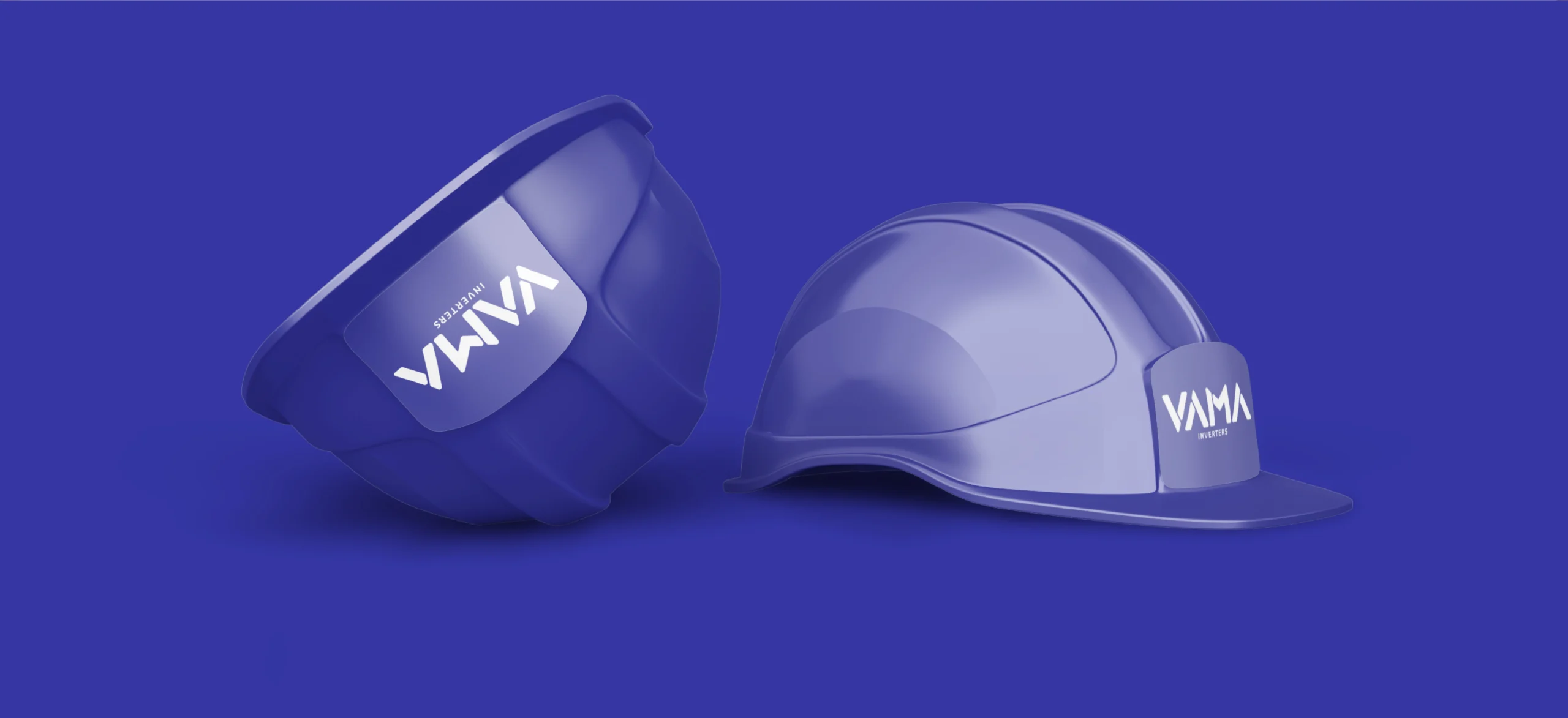
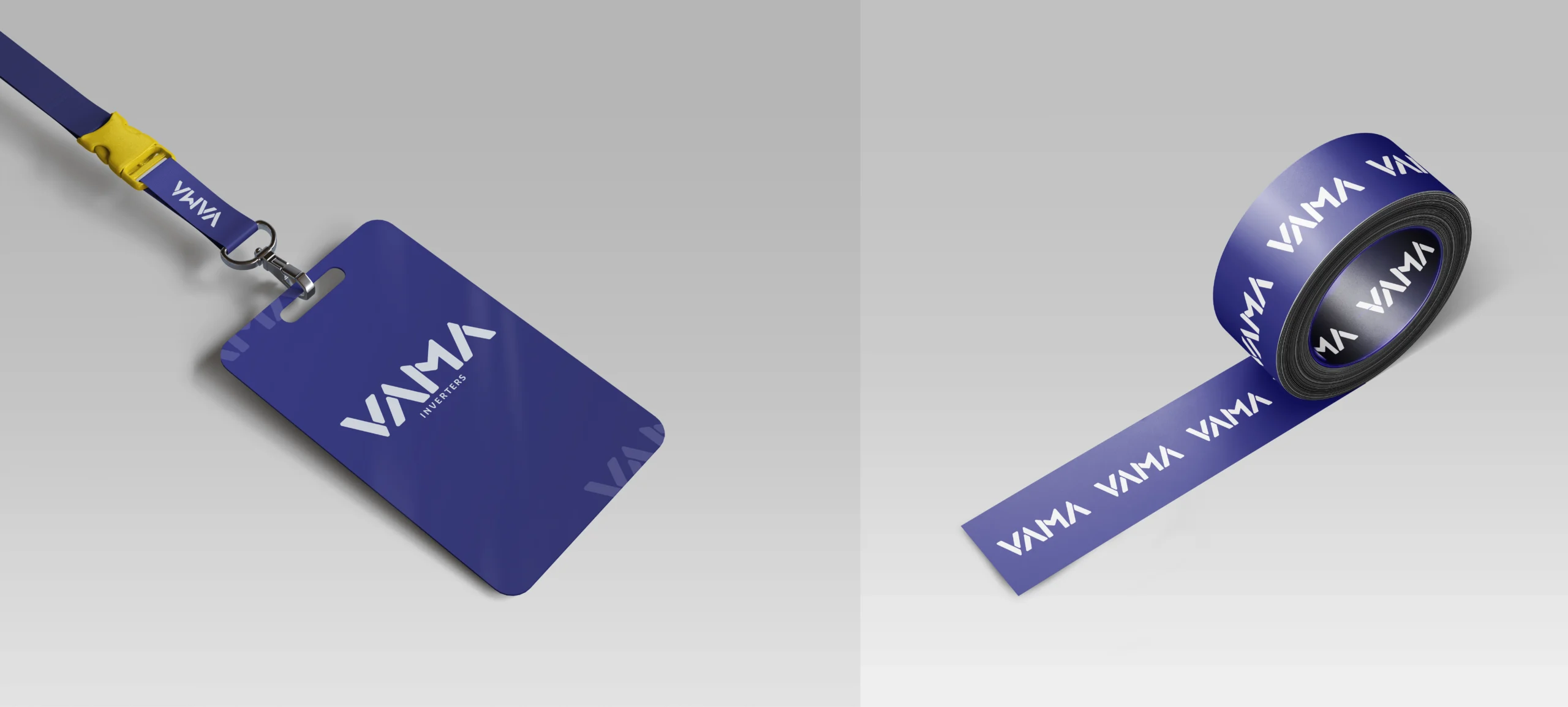
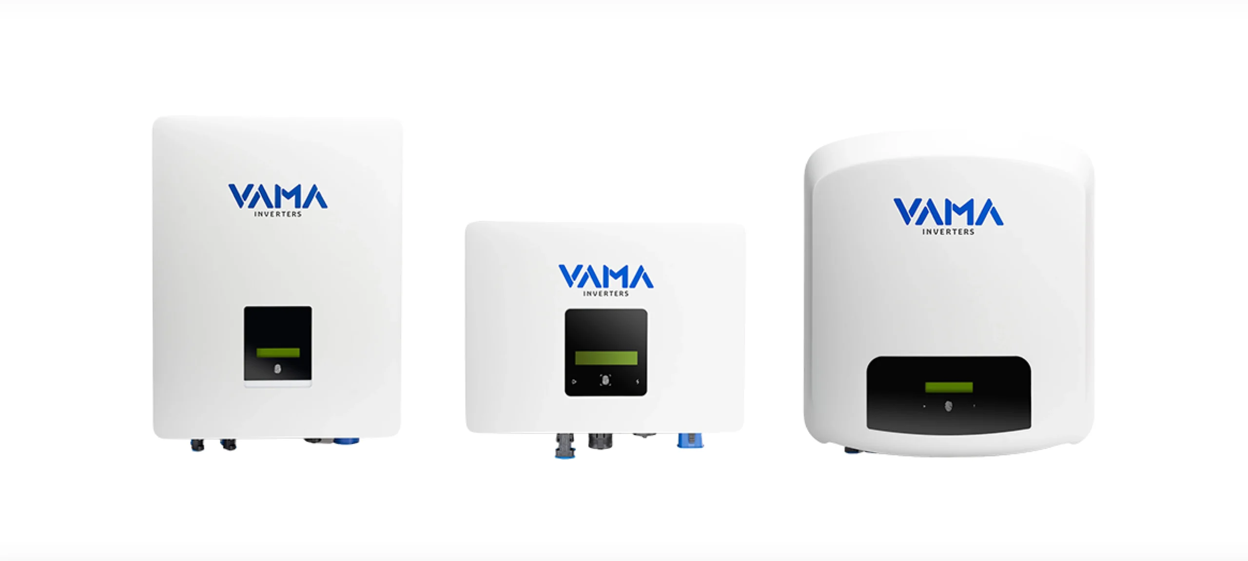
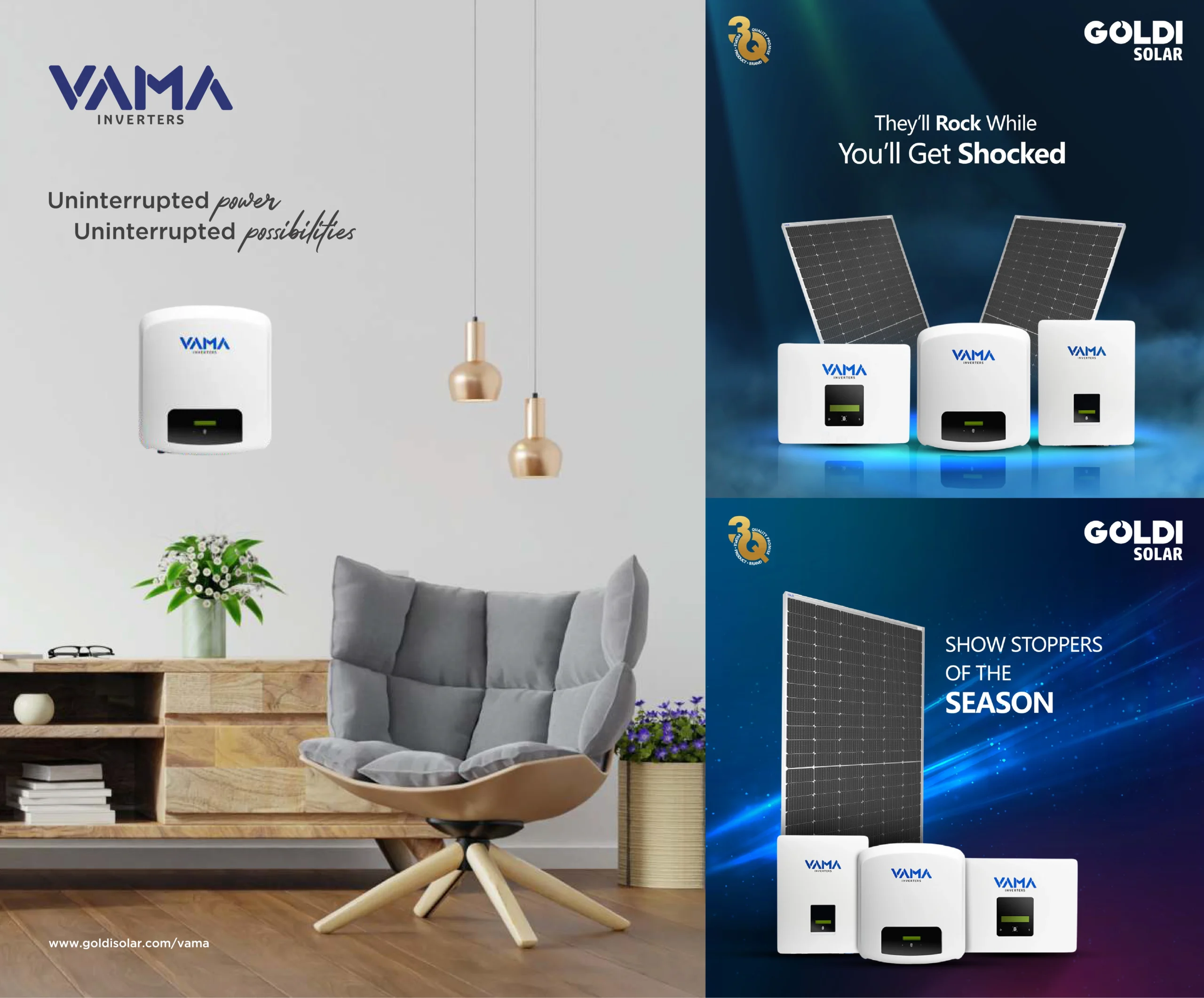
- The Visual System: From the logo, we built out a complete brand language covering typography, color, and layout. Every element was calibrated to feel consistent across touchpoints, from product packaging to digital communications, without losing the simplicity that makes the brand easy to recognise.
- The Brand Tone: The design had to hold two things at once: the precision of a technical product and the warmth of a brand speaking to real people. Nothing cold, nothing vague. Confident, focused, and built to lead in a space that is only getting more competitive.
The Final Result
Vama Inverters now has a brand identity that holds its own in the solar space. The logo, the visual system, and the overall direction give the brand a clear, confident voice. Whether someone encounters Vama on a product, a website, or a marketing piece, the identity says the same thing: this is a brand that knows what it is doing.
- Client: Goldisolar
- Category: Logo Design, Branding
- Role: Art Director, Lead Designer
-Explore More Project-
A collection of projects that blend creativity with strategy.
Keep browsing to see more