Cedar Crest College Poster Design
- About Project
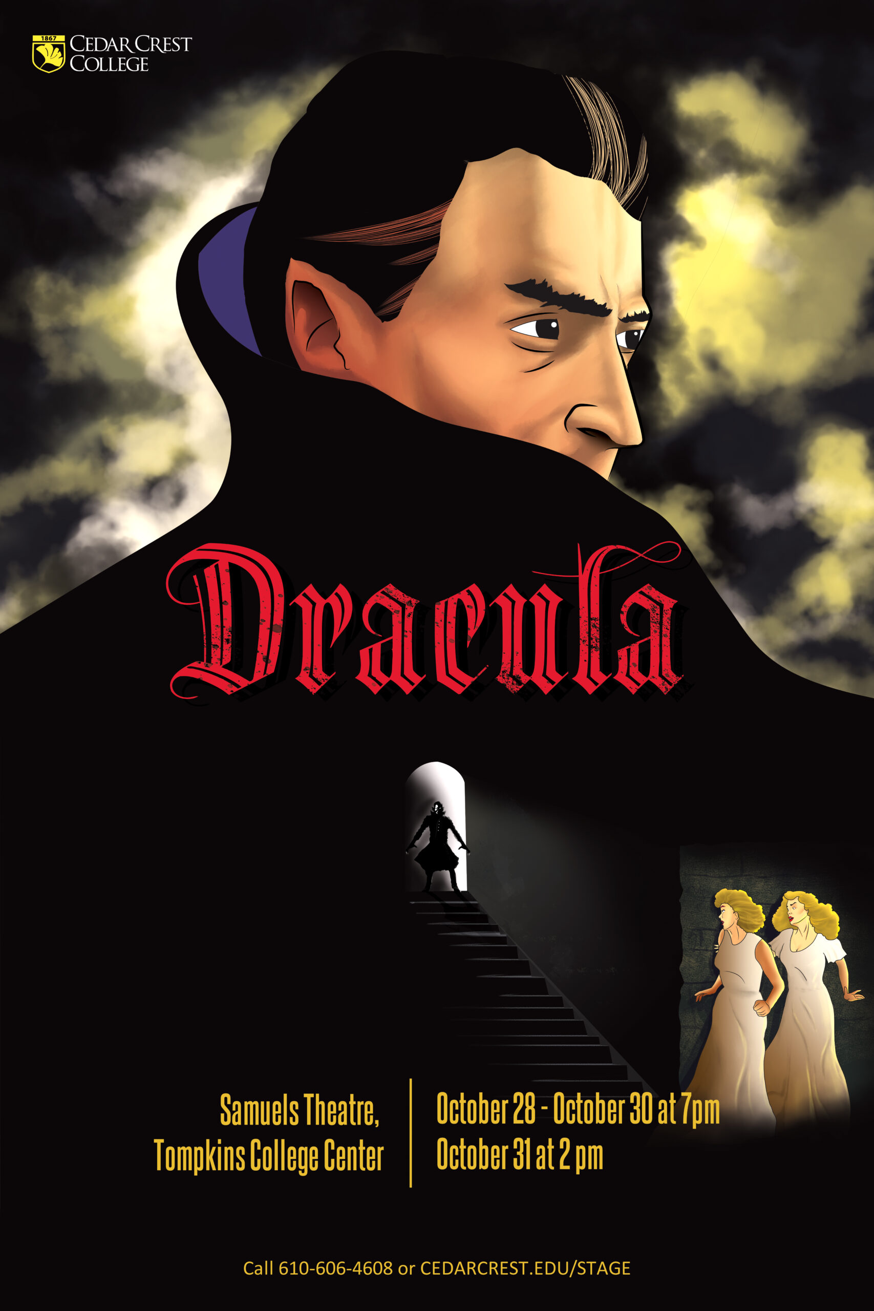
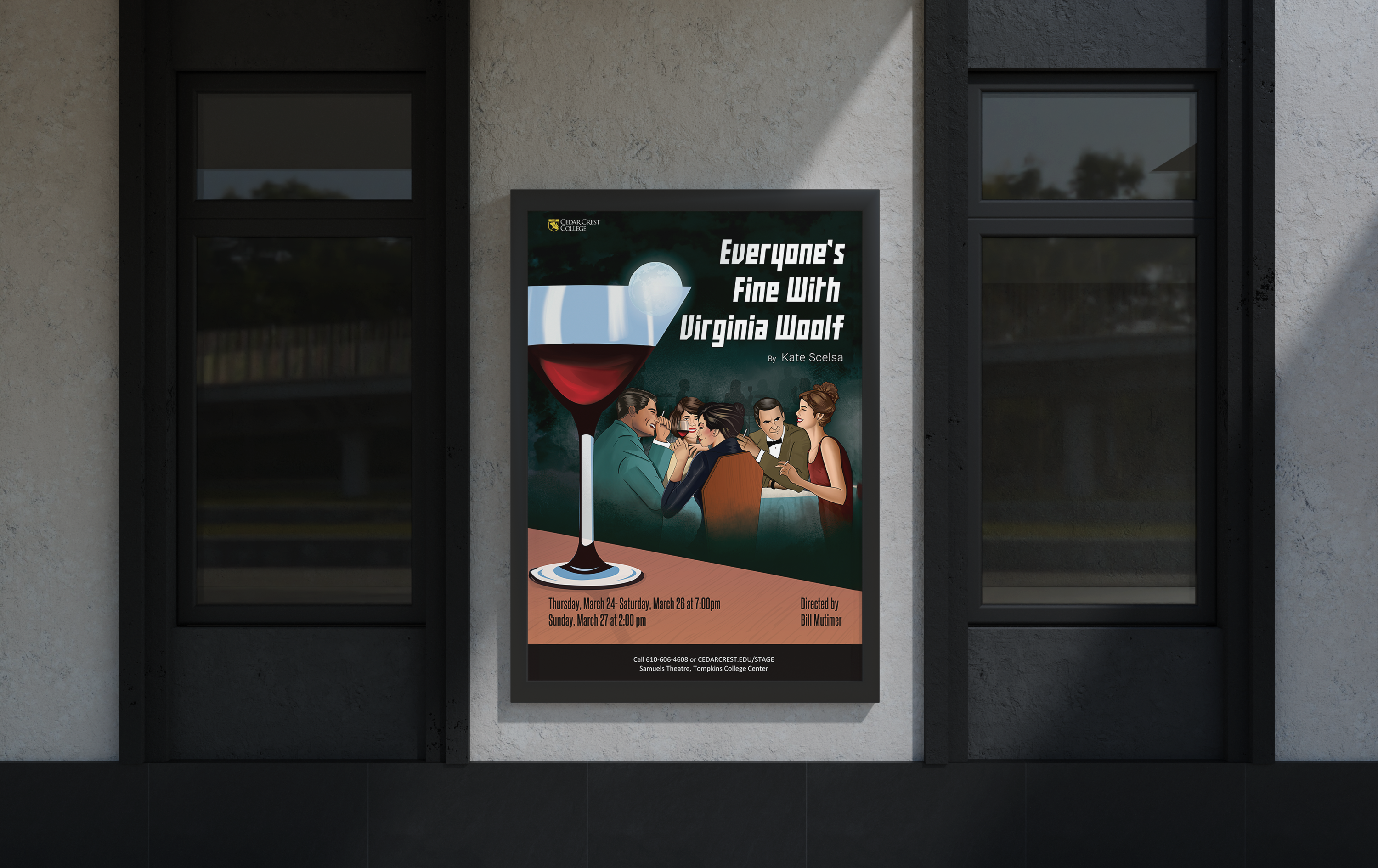
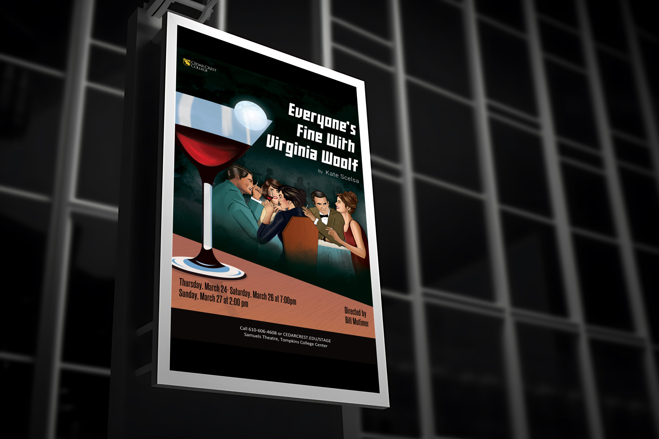
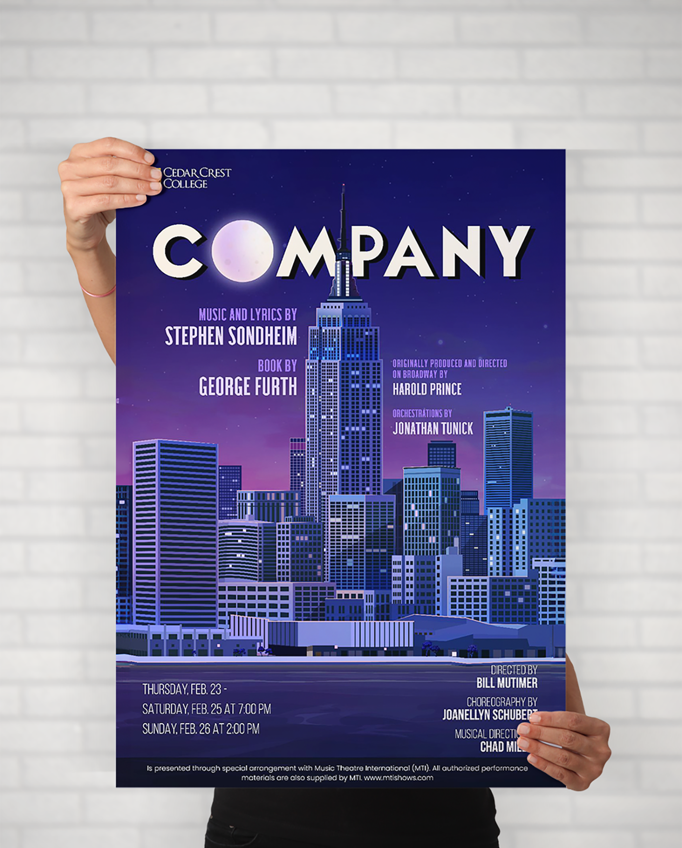
Cedar Crest College is a performing arts institution that needed promotional posters for their theatre productions. The shows were all different in tone, genre, and audience — Dracula, Company, Everyone's Fine With Virginia Woolf, Ghost Stories, Approaching Lavendar. Each one needed its own visual world while still feeling like it came from the same college theatre program.
The Design Challenge
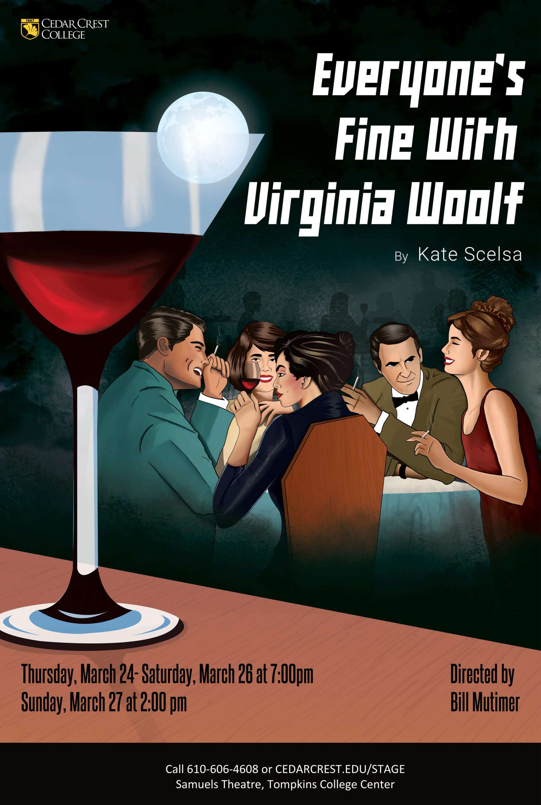
Theatre posters have one job: make someone stop, look, and want to buy a ticket. The challenge here wasn’t just designing something that looked good. Each production had a completely different mood. Dracula needed to feel dark and gothic. Company needed the energy of a big city musical. Virginia Woolf needed tension and intimacy. I had to switch gears completely between each one while keeping a standard of craft that represented the college well.
The Solution
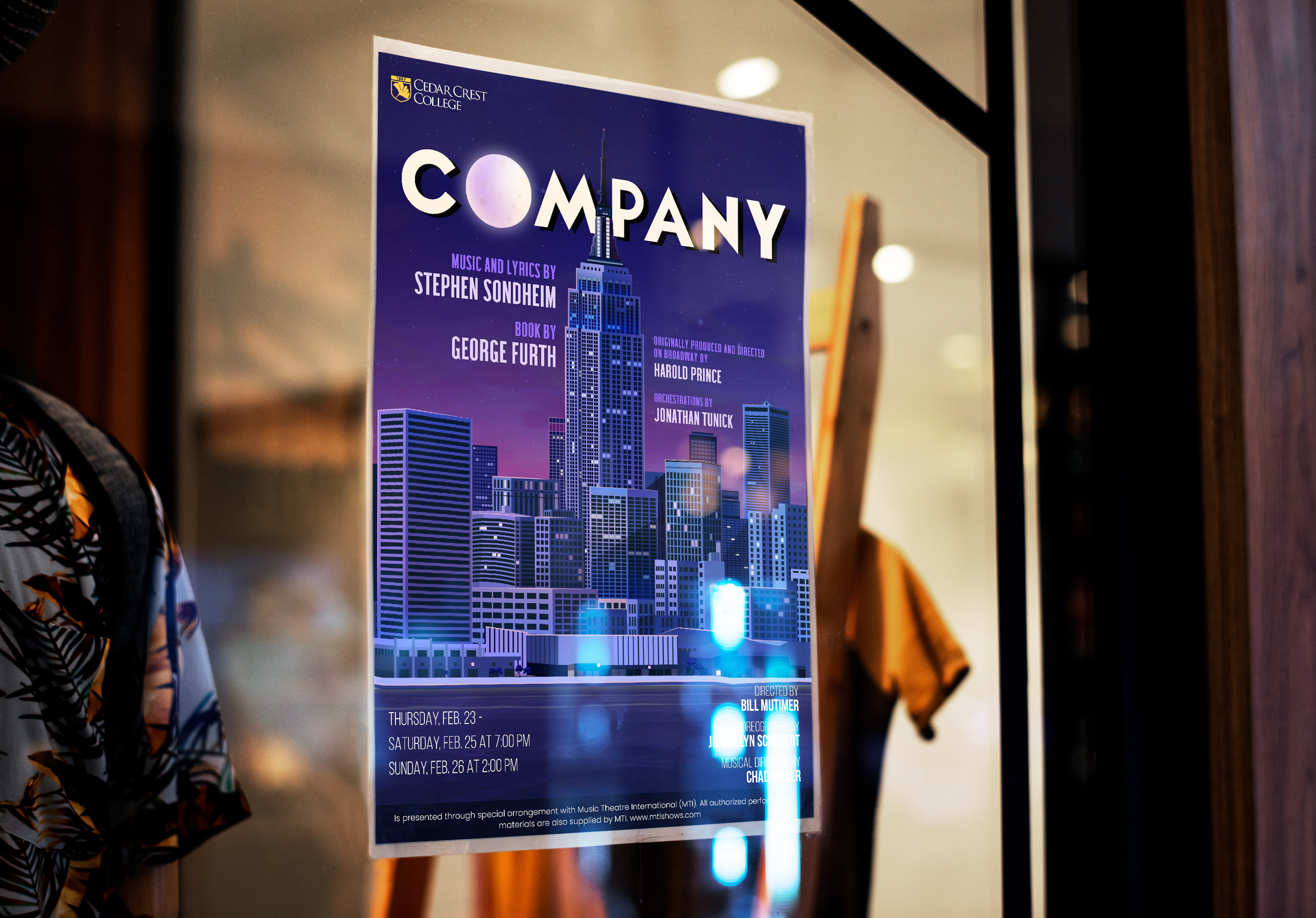
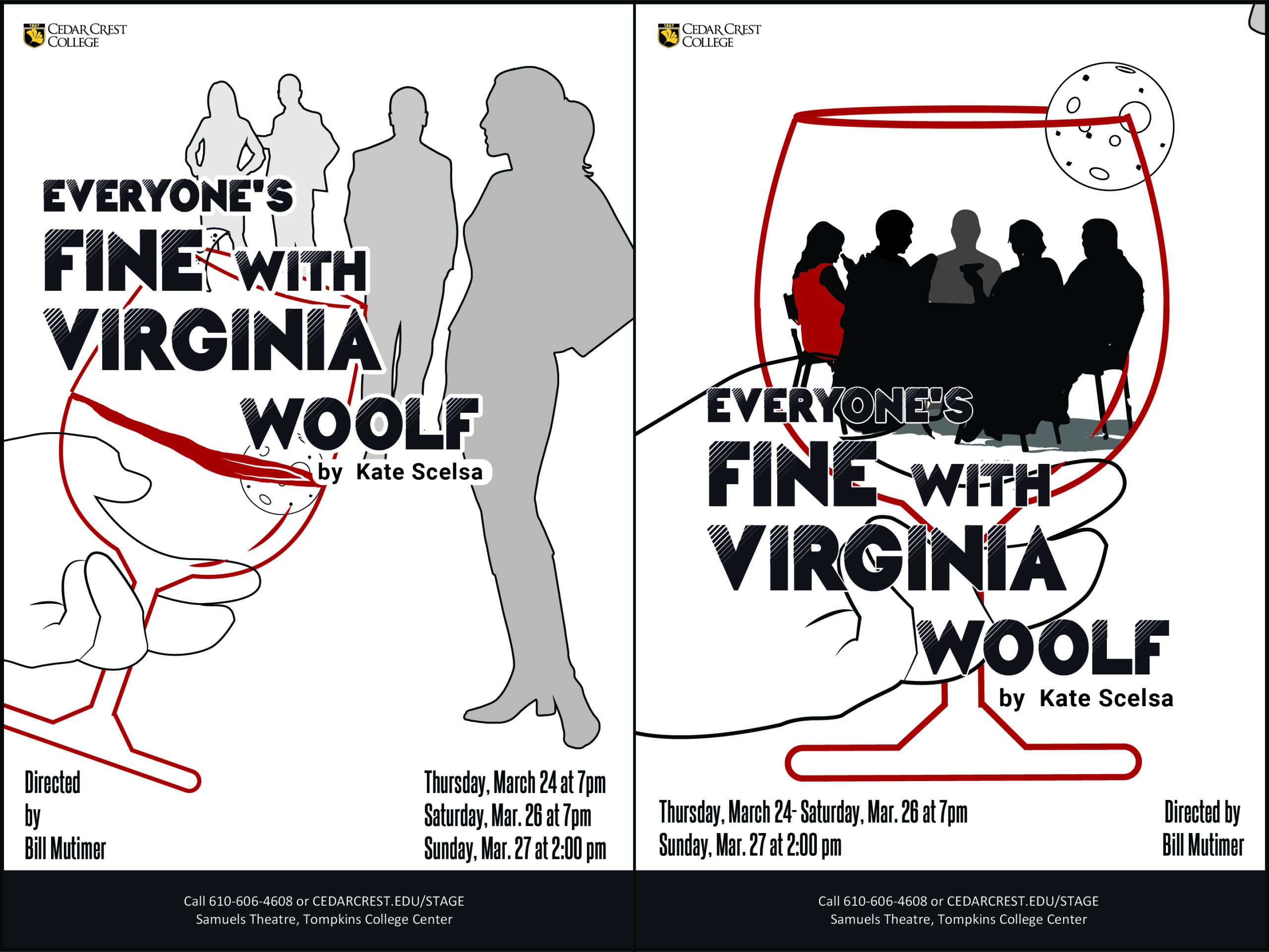
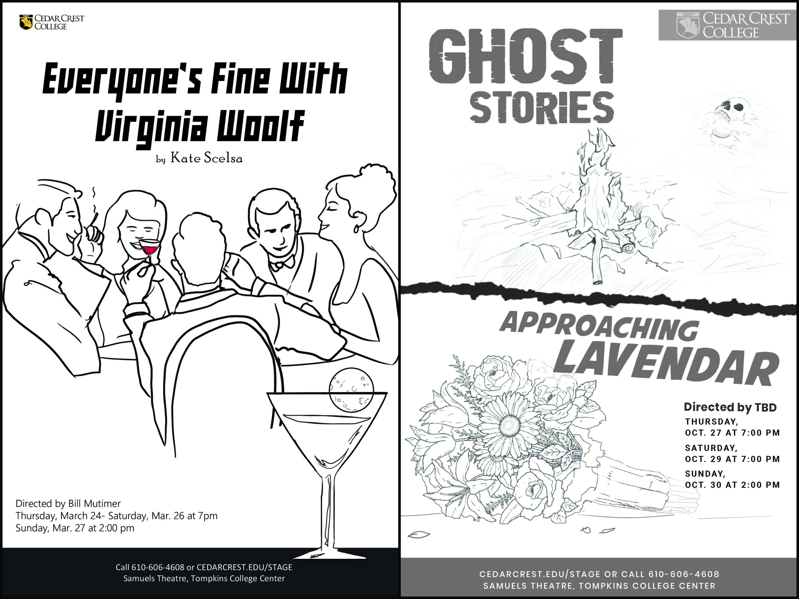
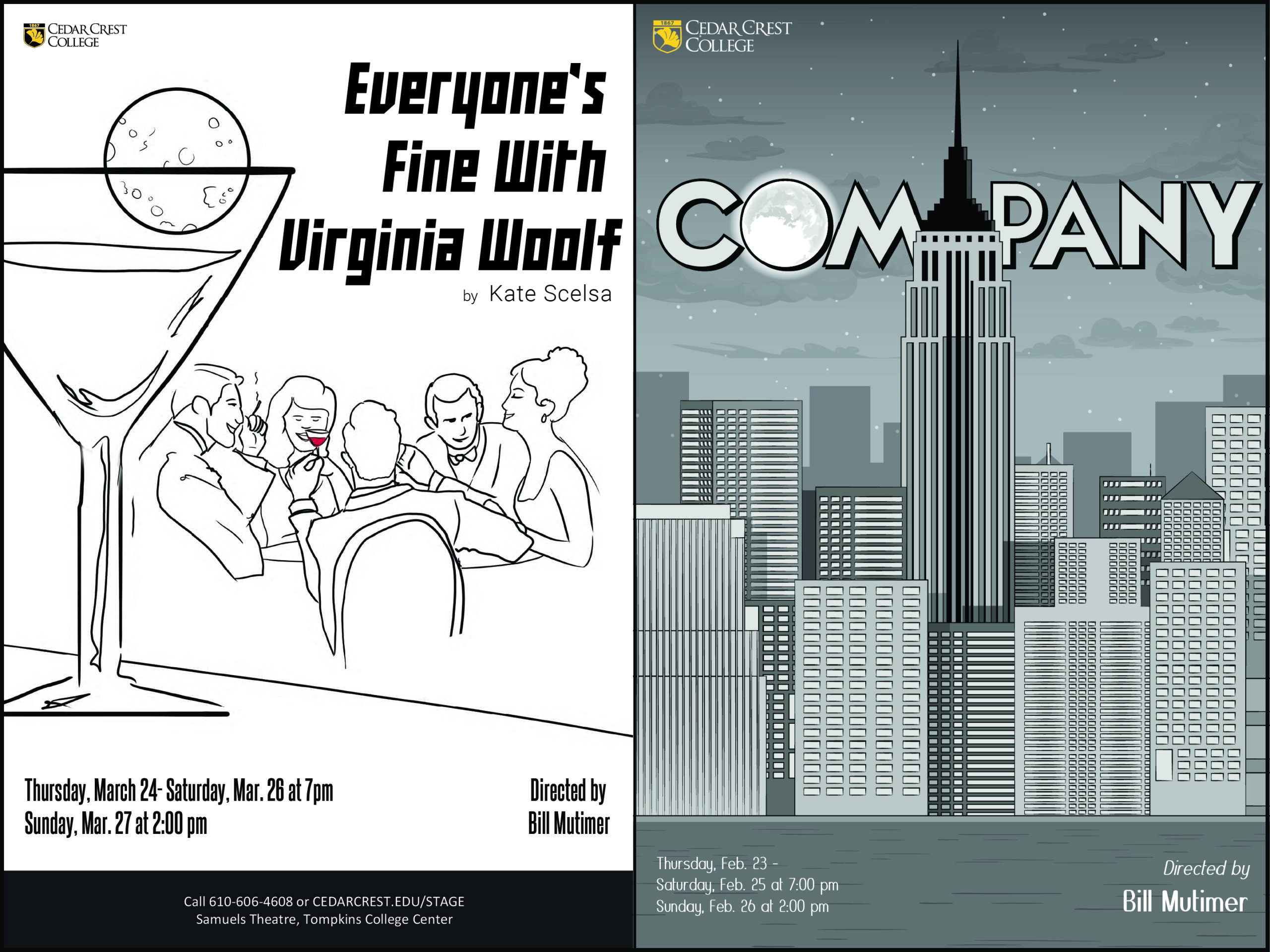
The Illustration: Each poster started with understanding what the play actually feels like. Not just the plot, but the atmosphere. Dracula got deep shadows, a classic horror composition, and a color palette that felt pulled from old film posters. Company got a bold typographic treatment against a city skyline, electric and contemporary. Virginia Woolf was more intimate: figures in a room, the tension sitting between them.
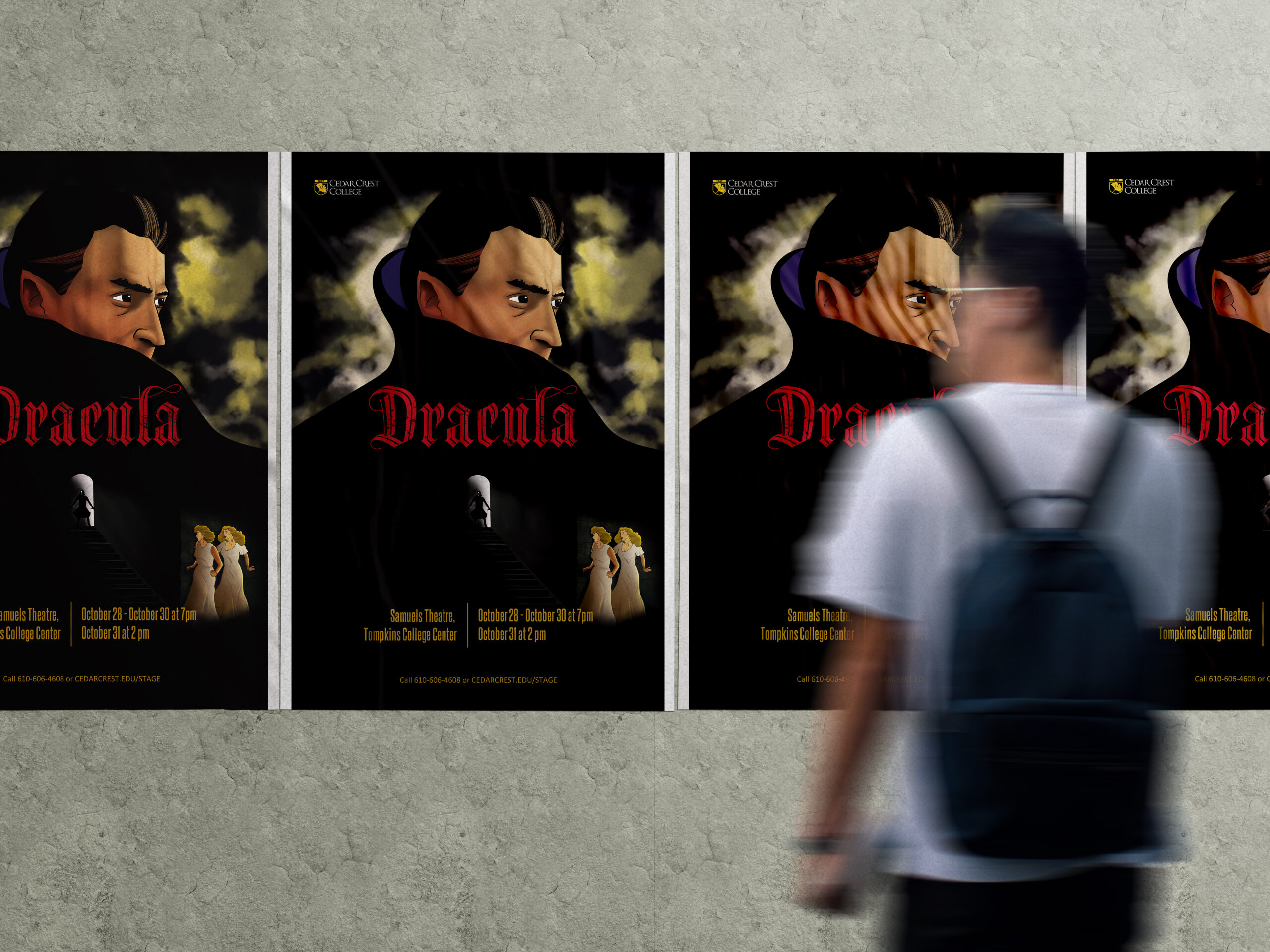
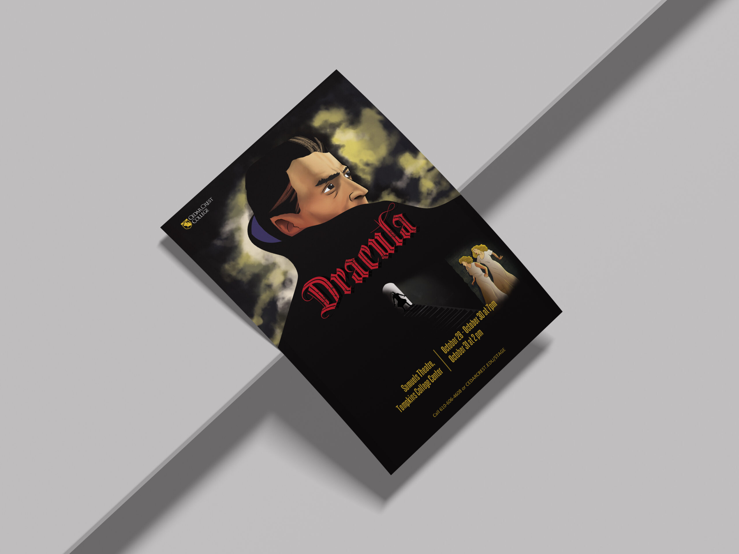
- The Compositions: Every poster had to work at multiple sizes and in multiple contexts: displayed outside the theatre, printed as handheld programs, shown on screens, and pinned on notice boards around campus. The compositions were built to hold their impact whether someone was standing in front of them or seeing them as a small thumbnail.
- The Details: Show dates, venue, director credits: all the practical information that has to live on a theatre poster without cluttering the design. Getting the hierarchy right so the eye lands on the title first, the image second, and the details third took careful attention on every single version.
The Final Result
Cedar Crest College got a set of posters that gave each production its own identity while maintaining a quality standard across the whole season. Each one looks like it belongs to a serious theatre program. Because it does.
- Client: Cedar Crest College
- Category: Illustration, Poster Design
- Role: Illustrator, Lead Designer