Sunspire
- About Project
Sunspire is a premium scented beeswax candle brand that wanted to stand apart in a category full of honey jars, hexagons, and bee illustrations. This was a white label project, executed on behalf of another designer. The brief was clear: build a brand identity that feels premium, feminine, and memorable, without leaning on any of the visual clichés the category defaults to.
The Design Challenge
Beeswax candles carry an inherent branding trap. The obvious move is to lean into the bee, the hive, the honey. Every competitor does some version of it. Sunspire wanted none of that. The challenge was to create an identity rooted in warmth, softness, and quiet luxury while leaving the category clichés completely behind. The logo and brand system had to work across product packaging, social media, and everything in between.
The Solution
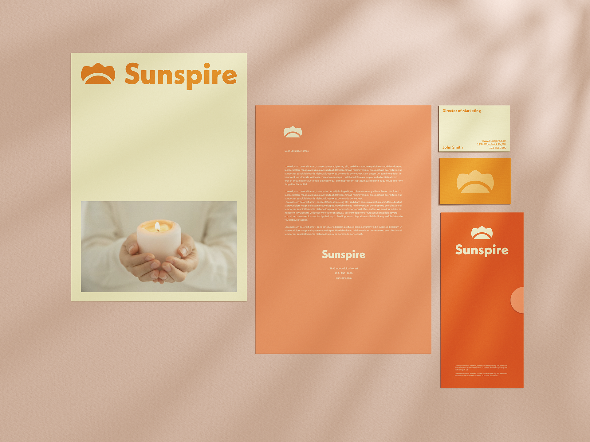
The Logo: The mark abstracts the idea of a rising sun into a soft, crown-like form made of three rounded arches sitting above a curved base. It suggests warmth, light, and a gentle glow without literally depicting a flame or a candle. The shape has an organic quality that feels handcrafted and considered, while the geometry keeps it clean enough to scale from a candle tin to a tote bag without losing its clarity. Paired with the wordmark in a confident, rounded sans-serif, the combination sits right at the intersection of modern and warm.
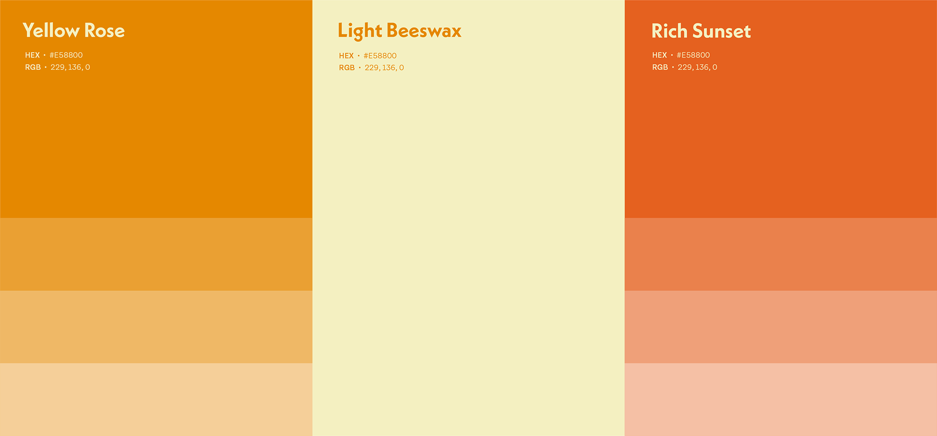
- The Color System: The palette was built around three tones: Yellow Rose, Light Beeswax, and Rich Sunset. Burnt orange, cream, and a warm salmon pink. Nothing cold, nothing corporate. The colors reference the raw material of the product without spelling it out, and they work together across packaging surfaces in a way that feels cohesive and premium on shelf.
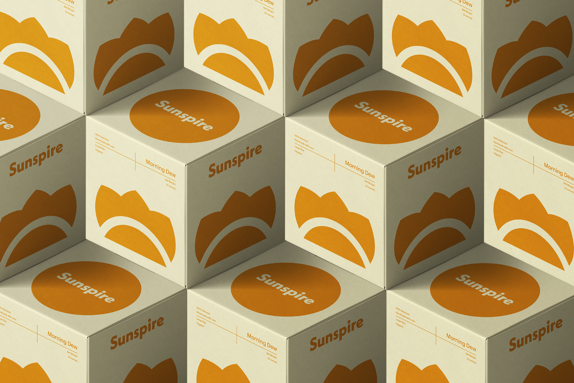
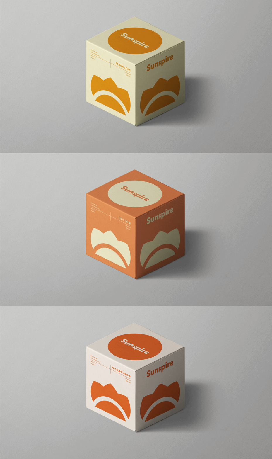
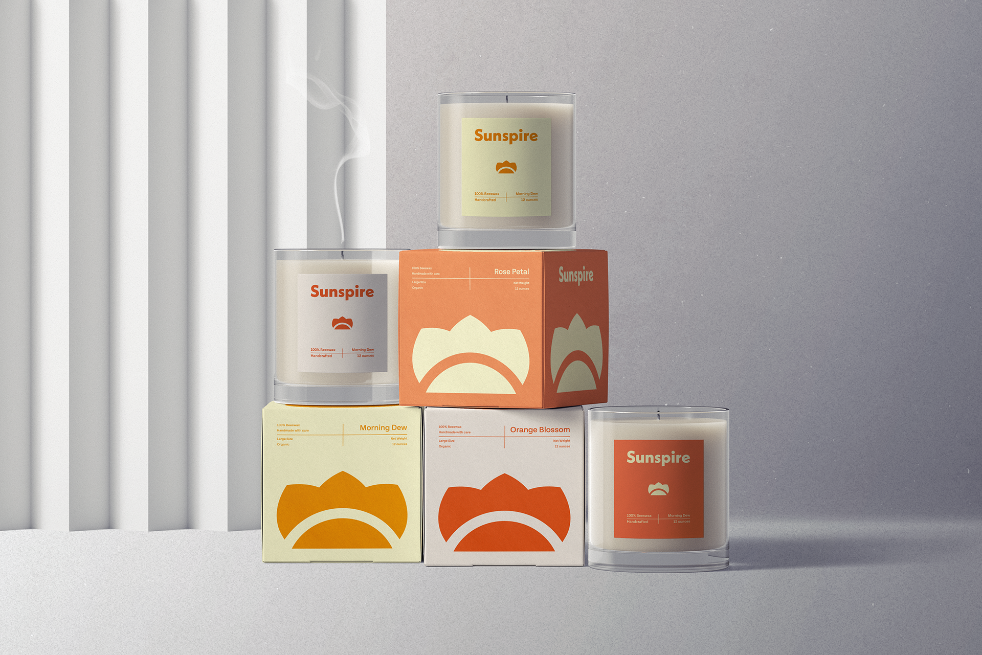
- The Packaging: The brand system was extended across candle tins, folding boxes, stationery, and brand collateral. The logo mark used large and cropped on packaging faces creates a bold, repeating pattern that gives the product a strong visual presence, especially when displayed together. The isometric box pattern in particular shows how a simple mark can become a full surface design when the system is built with that flexibility in mind.
The Final Result
Sunspire has a brand identity that earns its place in the premium candle space without looking like everything else on the shelf. The logo is distinctive, the palette is warm and considered, and the system scales beautifully from packaging to print. Simple, iconic, and feminine, exactly what the brief asked for.
- Client:
- Category: Logo Design, Branding
- Role: Design