Aeropaarth
- About Project
AeroPaarth is a private aviation company in India. They handle everything: private jet charters, helicopter bookings, aircraft sales, MRO, and even Char Dham yatras by helicopter. When they came to me, the services were solid and the reputation was real. But nothing about their visual identity was reflecting that.
The Design Challenge
Private aviation is a high-trust space. A CEO booking a jet, a family planning a pilgrimage, someone needing an air ambulance at 2am. They all land on the same brand and make a decision in seconds. Most aviation companies in India either look too stiff and corporate, or too generic to be taken seriously. I needed AeroPaarth to feel like it belonged in a different league. Premium, but still warm enough to not push people away.
The Solution
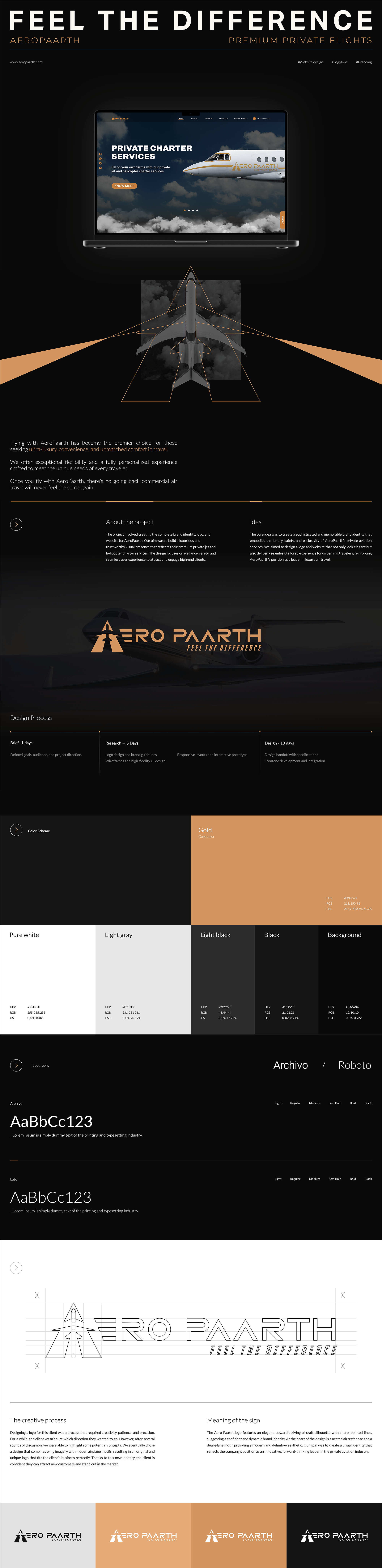
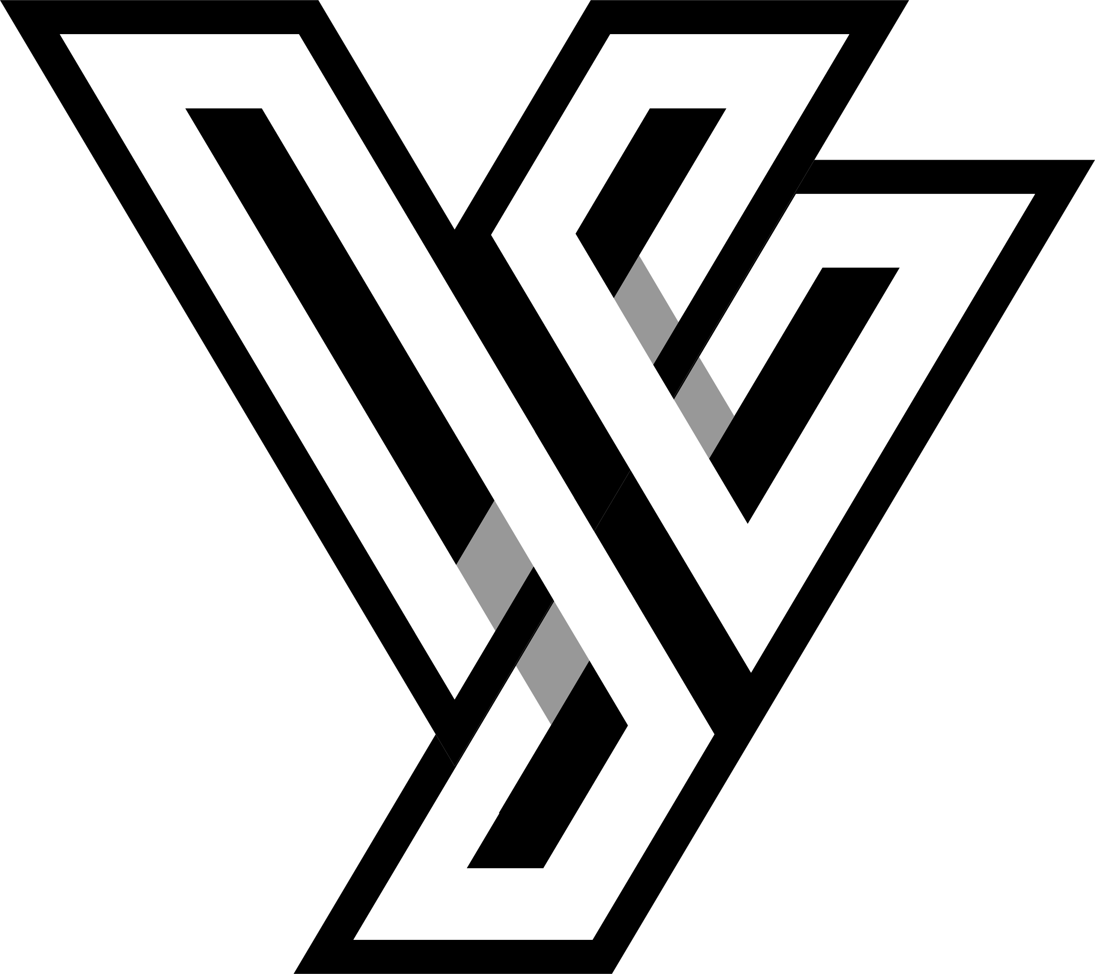
The Logo: This is where everything started. The “A” in Aeropaarth isn’t just a letter. It’s doing three things at once. The shape forms a runway at the base, mountain peaks at the top, and an airplane sits right at the center. Three ideas that define what AeroPaarth actually does: taking off, reaching new heights, going places others can’t. It all lives in one clean, confident mark. The gold tone was a deliberate choice: warm enough to feel premium, strong enough to mean business. This wasn’t decoration. It was the entire brand story compressed into a single symbol.
- The Branding: Once the logo was locked, I built the full identity around it: color palette, typography, visual language. The gold and dark palette carries that same feeling across every surface. Sharp but never cold, premium but never out of reach. The brand had to stretch across very different contexts. A corporate jet booking and a Char Dham pilgrimage yatra, feeling at home in both.
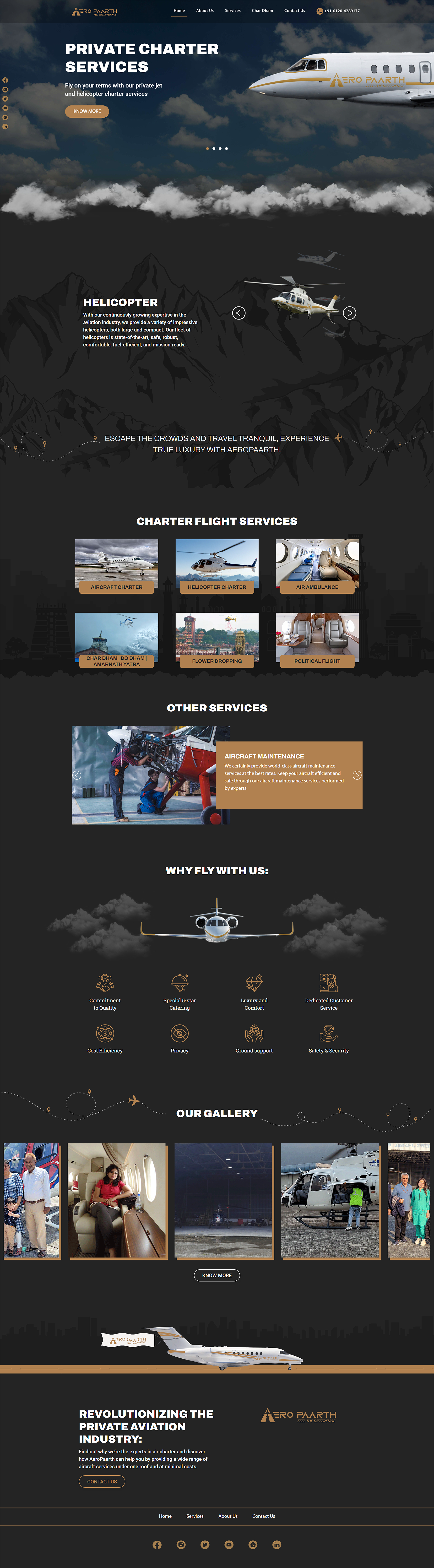
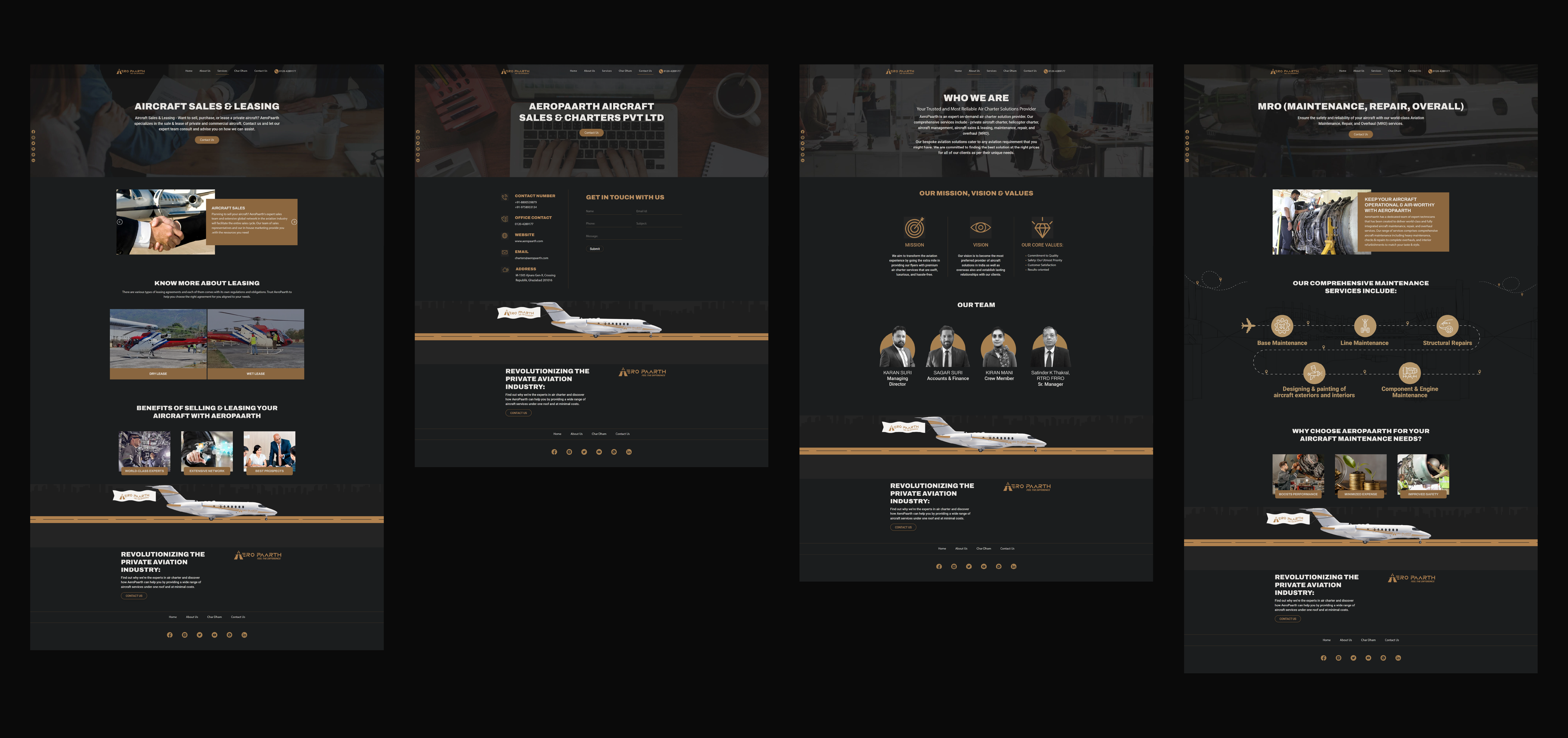
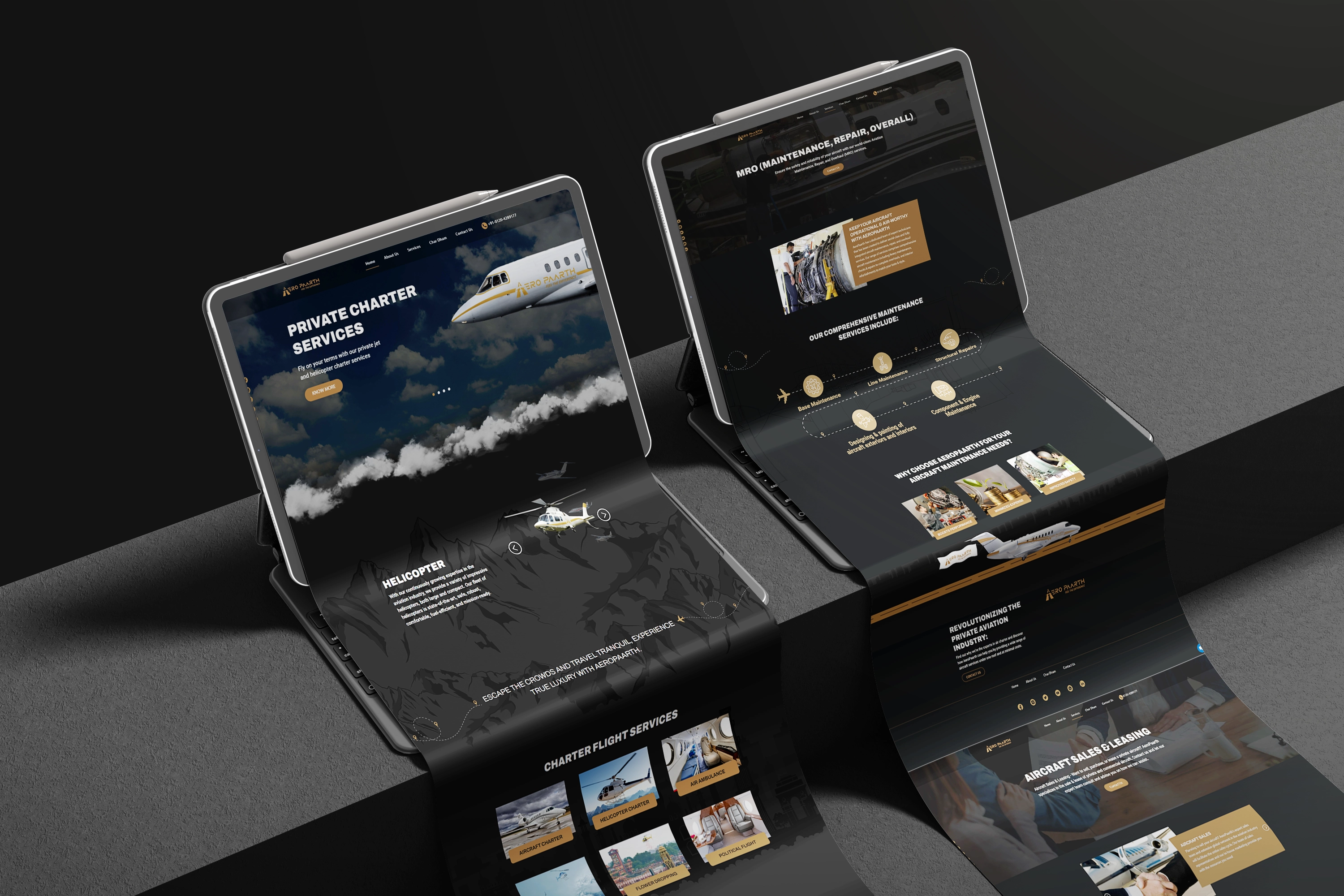
- The Website: With a solid brand in hand, the website came last. Seven services, one coherent experience. I restructured the entire site so each service had its own clarity without ever feeling disconnected from the brand. The homepage was treated like a boarding gate: every scroll, every section placed to build confidence before the client even reaches the contact page.
The final result
AeroPaarth now has a logo people remember, a brand system that holds together, and a website that converts. Whether someone sees the mark on an aircraft or finds the site through a Google search, the feeling is always the same. These people are the real deal.
- Client: Aeropaarth
- Category: Logo Design, Brand Identity, Web Design
- Role: Art Direction, Visual Identity Design, UI/UX Design