
Conductor Brand illustrations
- About Project
Conductor is a content marketing and SEO platform used by enterprise brands to grow organic traffic and measure content performance. They needed a comprehensive illustration library that could carry their brand voice across the platform, blog content, and marketing materials. This was a white label project, delivered on behalf of another designer.
The Design Challenge
Enterprise SaaS brands often default to the same generic illustration styles: soft gradients, faceless figures, predictable metaphors. Conductor wanted something with more personality and edge. The illustration system had to feel distinctive enough to own while still being versatile enough to cover a wide range of topics, from SEO data and content strategy to workplace culture, community, and everyday human moments. The library also had to scale, covering dozens of scenes without the style feeling repetitive or stretched.
The Solution
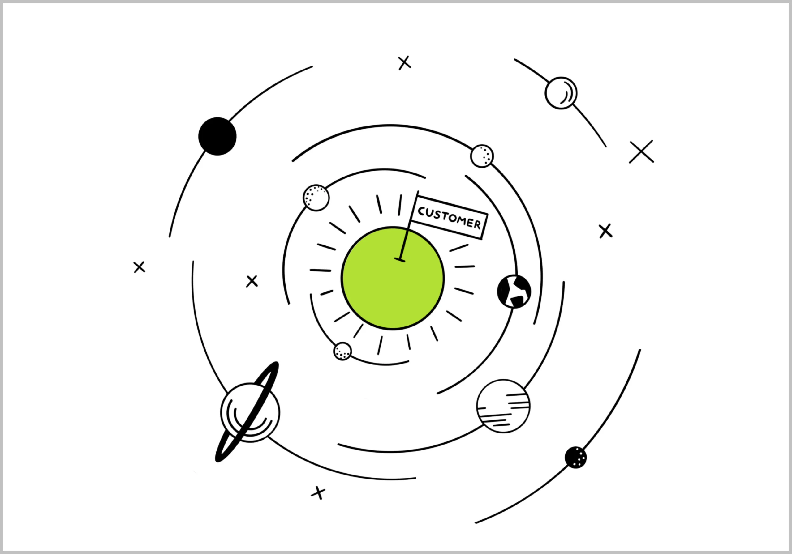
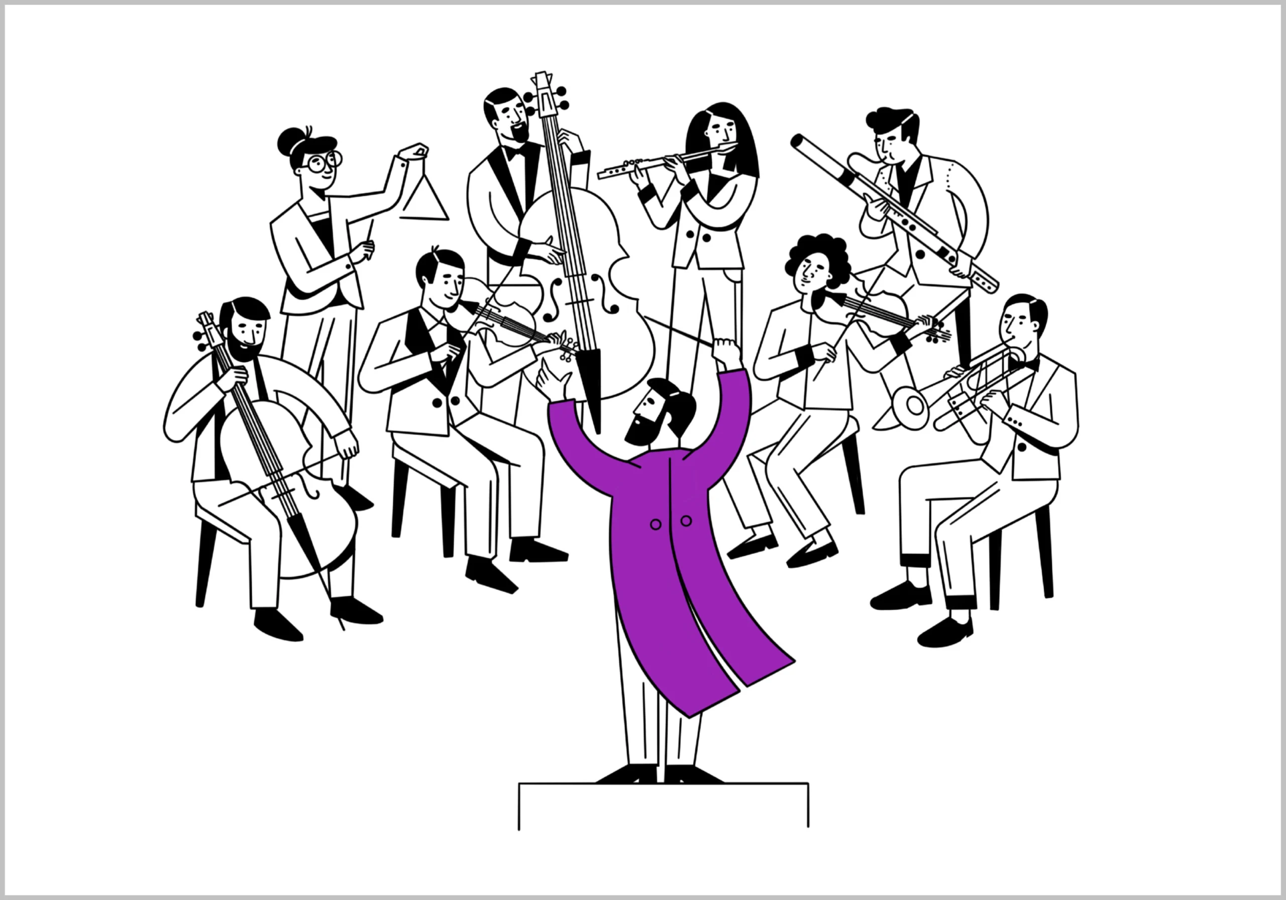
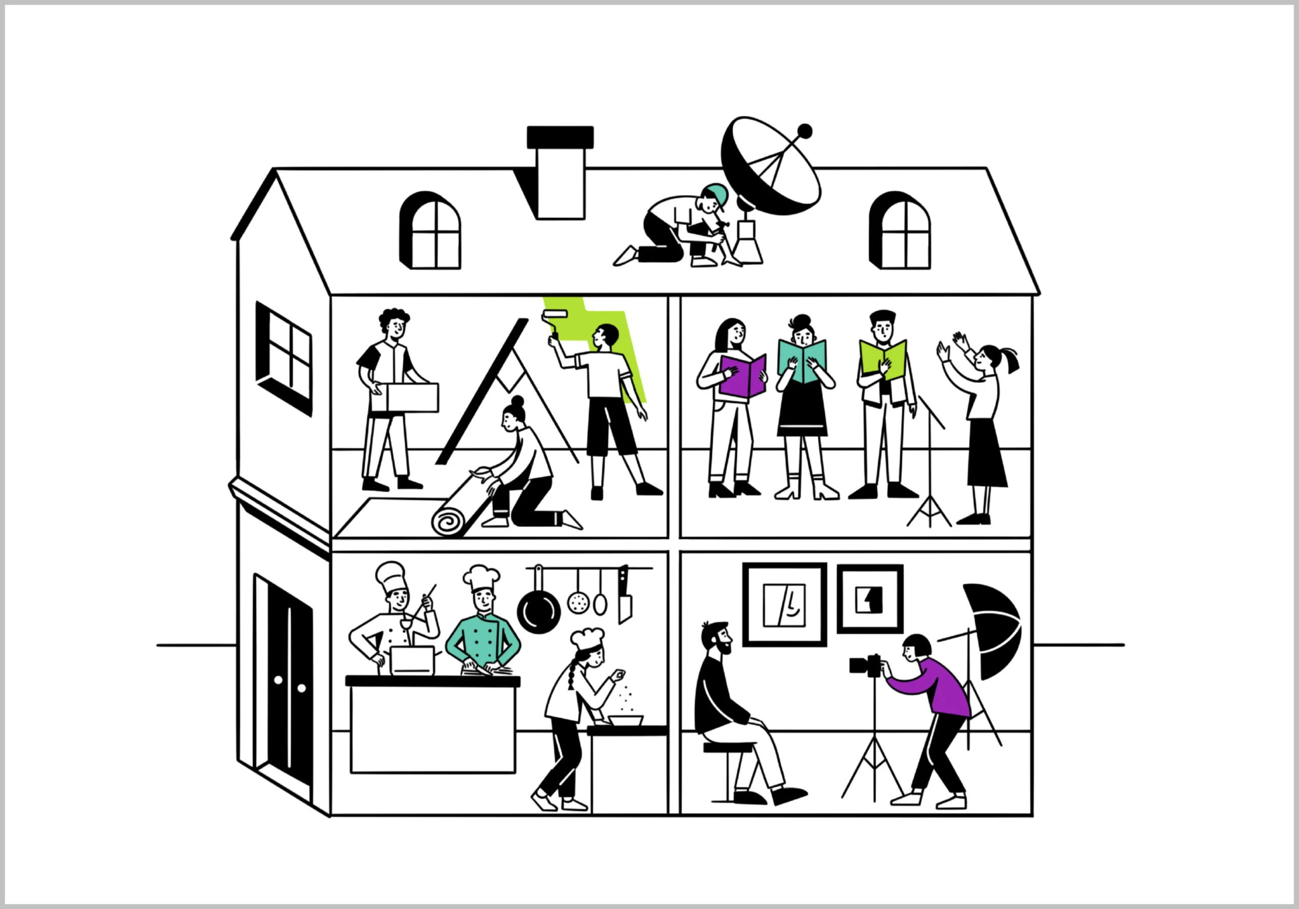
The Illustration Style: The system was built on bold, confident line work with a deliberately limited color palette: black outlines, flat green, and purple accents on white. No gradients, no unnecessary complexity. The restraint in color is what gives the style its personality. Every scene reads immediately and holds its own whether it appears small on a dashboard or large on a landing page.
- The Figures and Scenes: The characters were designed with expressive body language and loose, energetic proportions that feel human without being overly polished. Scenes range from data analysis and telescope-style research to community gatherings, home working, street markets, and rocket launches. The range demonstrates that the style was built to stretch across topics without losing its identity.
- The Consistency: With a library this large, visual consistency is everything. Line weight, figure construction, spatial relationships, and color application were kept disciplined across every single illustration so the full set reads as one cohesive system regardless of the subject matter.
The Final Result
Conductor got an illustration library with a strong, ownable visual identity that stands apart from the generic SaaS aesthetic. The style has enough range to cover almost any content topic while remaining immediately recognizable as theirs. Delivered cleanly as a white label project, on brief and on time.
- Client: Conductor
- Category: Illustration
- Role: Illustrator, Art Director
























-Explore More Projects-
A collection of projects that blend creativity with strategy.
Keep browsing to see more