- About Project
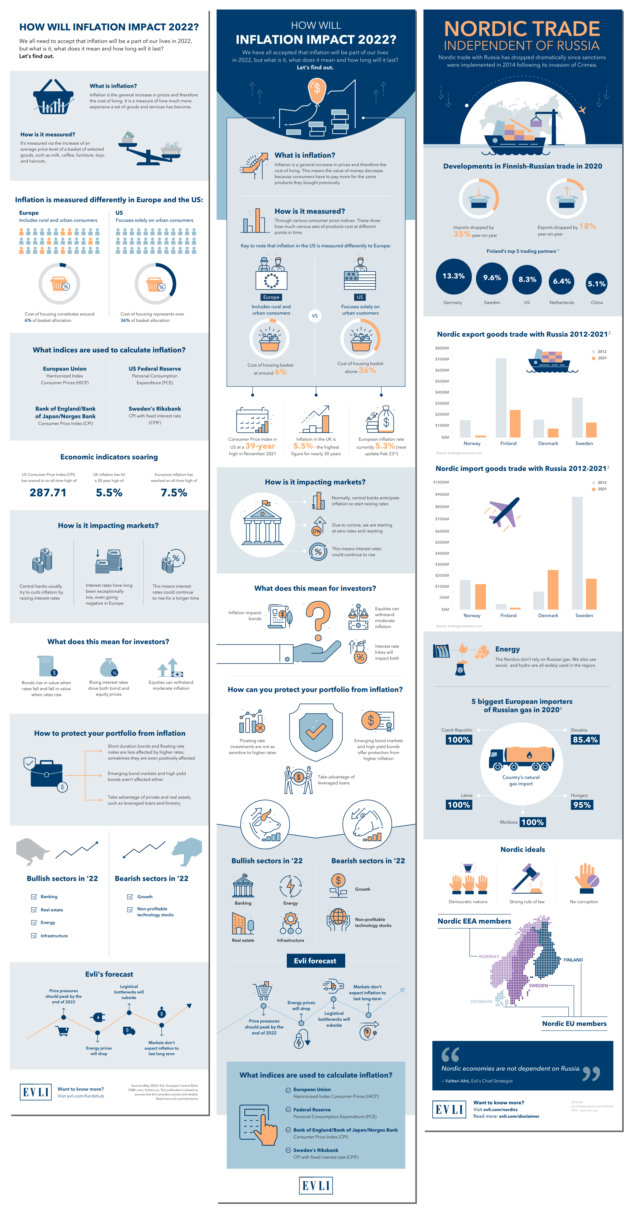
Evli is a Nordic investment bank known for its expertise in fund management and financial advisory. To communicate complex economic data to their audience, they needed a series of three infographics explaining how inflation would impact markets and investment behavior in 2022. The research was solid. It just needed to be made visual and accessible.
The Design Challenge
Financial data is notoriously difficult to communicate. Numbers alone do not tell a story, and overly simplified visuals can strip away the credibility that a firm like Evli depends on. The infographics had to translate dense economic insight into something a reader could move through quickly, without feeling like anything was being dumbed down. Three separate panels needed to feel like one cohesive piece.
The Solution
The Structure: Each infographic was designed with a clear visual hierarchy so the reader always knew where to look next. Data points, charts, and illustrated elements were arranged to guide the eye naturally from headline insight to supporting detail, making the information feel digestible without losing depth.
- The Visual Language: The design used Evli’s brand palette as the foundation, with a clean, editorial layout that gave the data room to breathe. Illustrated figures, icons, and data visualizations were built consistently across all three panels so the series felt unified from the first infographic to the last.
- The Data Visualization: Charts and comparative figures were designed to communicate the key takeaways at a glance. The goal was not just accuracy but immediate clarity. A reader scanning for thirty seconds and a reader studying for five minutes had to both come away with the right understanding.
The Final Result
Evli had an infographic series that made a complex economic topic approachable without sacrificing the authority their audience expects. The design system was built to scale, allowing multiple infographics to be produced consistently under the same visual framework. Each piece carried the same clarity and credibility, no matter the topic or volume.
- Client: Evli
- Category: Infographic Design, Data Visualization
- Role: Infographic Designer, Lead Designer