Trace One
- About Project
Trace One is a global SaaS platform built for retailers and consumer goods companies. They connect over 20,000 businesses across 100+ countries to develop, manage, and bring products to market. The brand elements were already there. The logo existed, the colors were defined, the product was established. What they needed was someone to take all of those pieces and build a system that made sense of them.
The Design Challenge
Trace One operates across markets, languages, and touchpoints at the same time. A brand that works in a Paris boardroom has to work equally on an exhibition stand in Chicago, a digital banner, and a Word document sent to a supplier in London. The problem wasn’t the brand itself. It was that different teams were using it differently, and nothing was holding it together. I needed to take what already existed and turn it into something that anyone, anywhere in the organisation, could pick up and use correctly.
The Solution
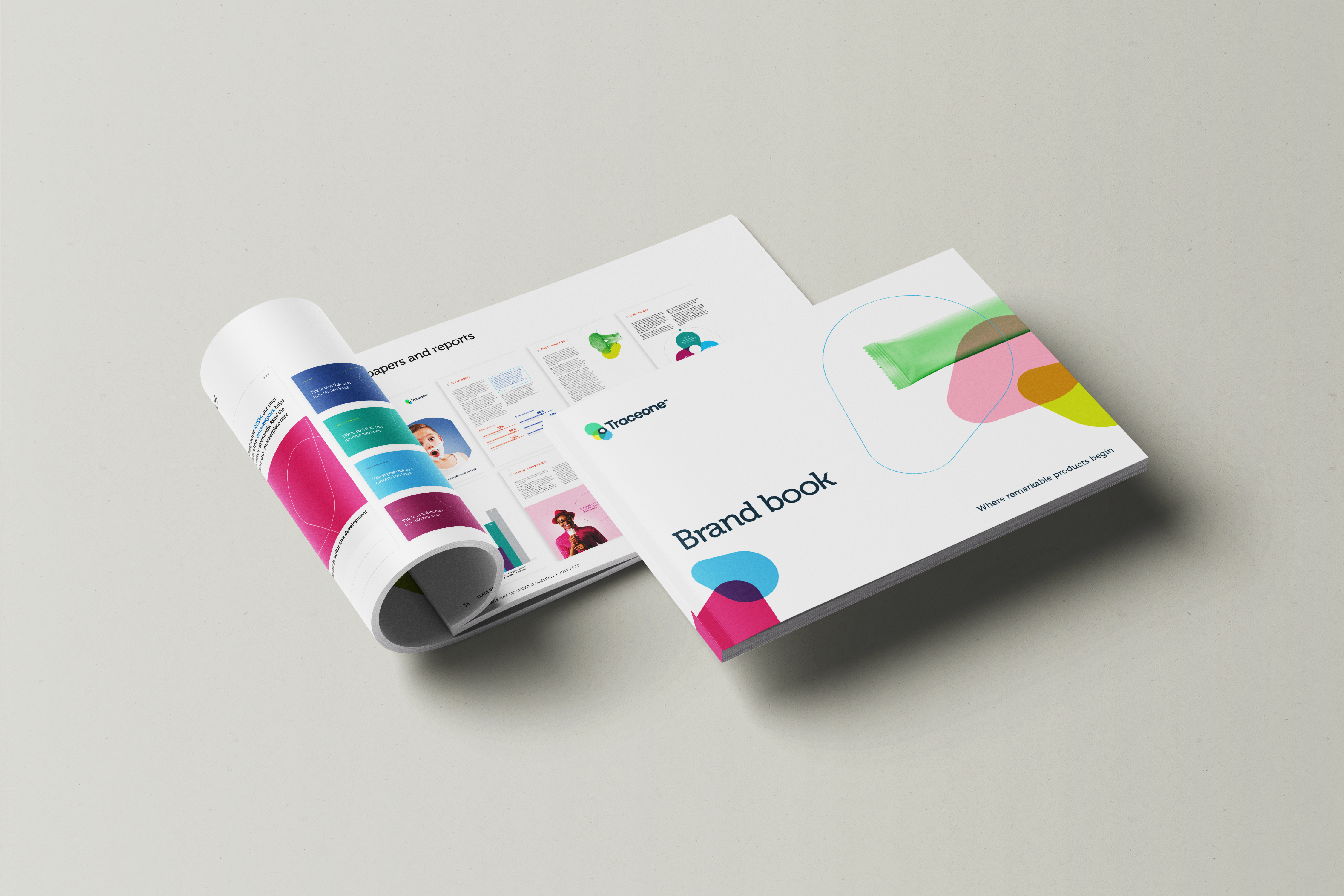
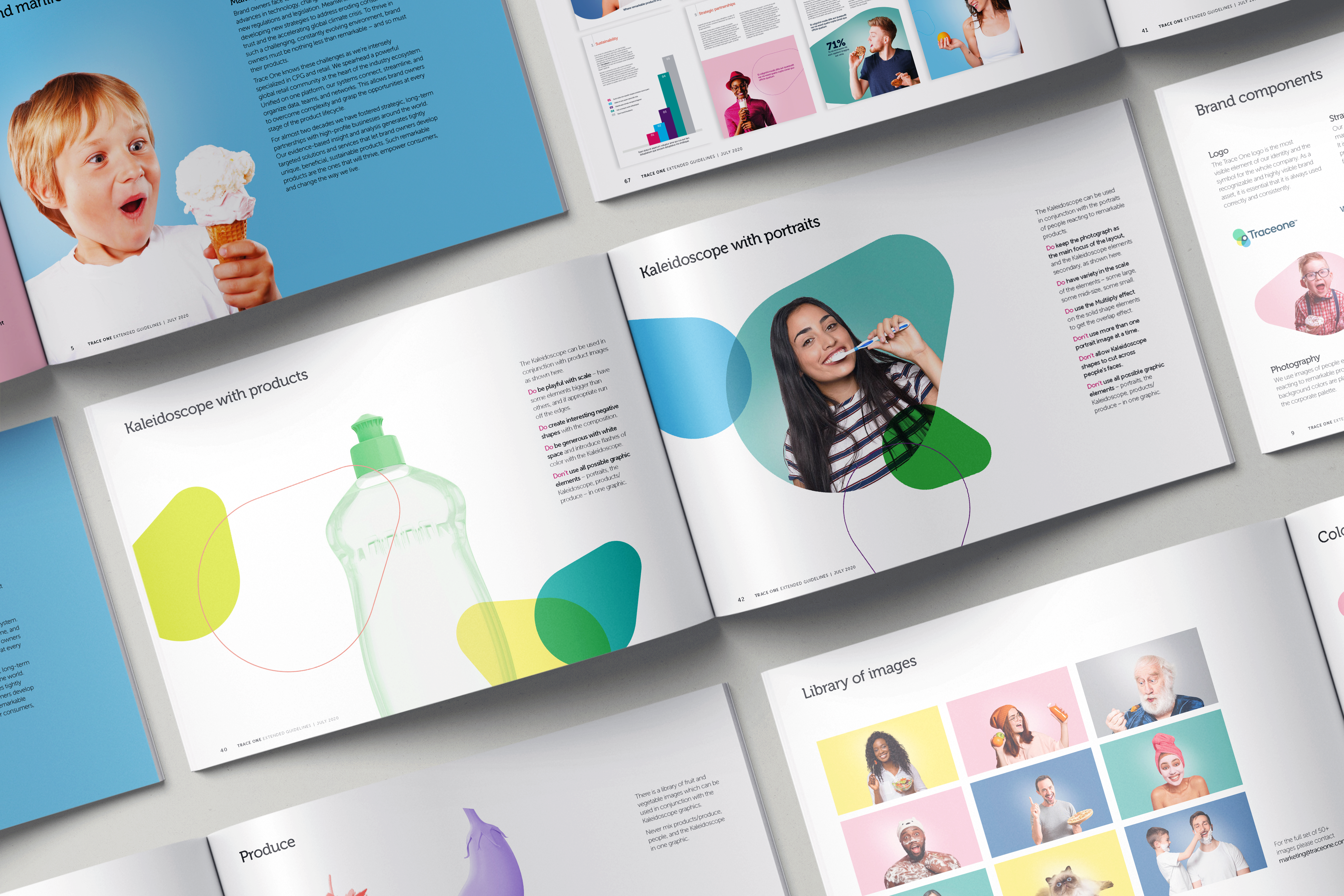
The Brand Book: I started by understanding the brand elements Trace One already had — the logo, the Kaleidoscope graphic built from the logo’s geometry, the corporate color palette, and five separate solution palettes for Marketplace, E-Sourcing, PLM, QMS, and Insight. My job was to build a system around them. Not to reinvent, but to organise, define, and give each element clear rules so the brand could finally work at the scale the business was operating at.
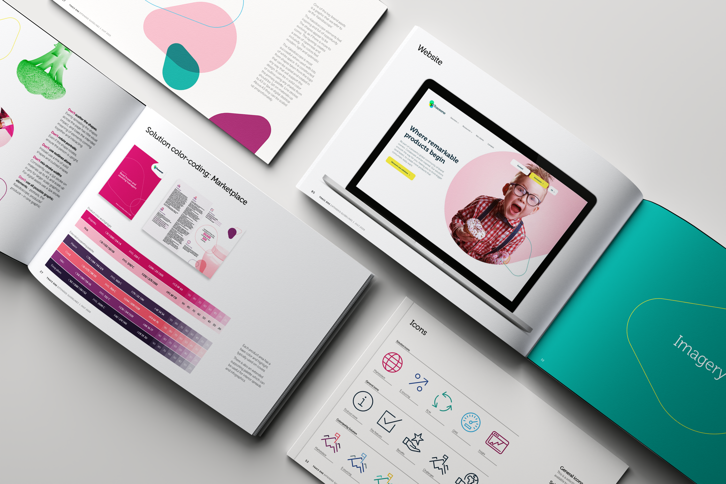
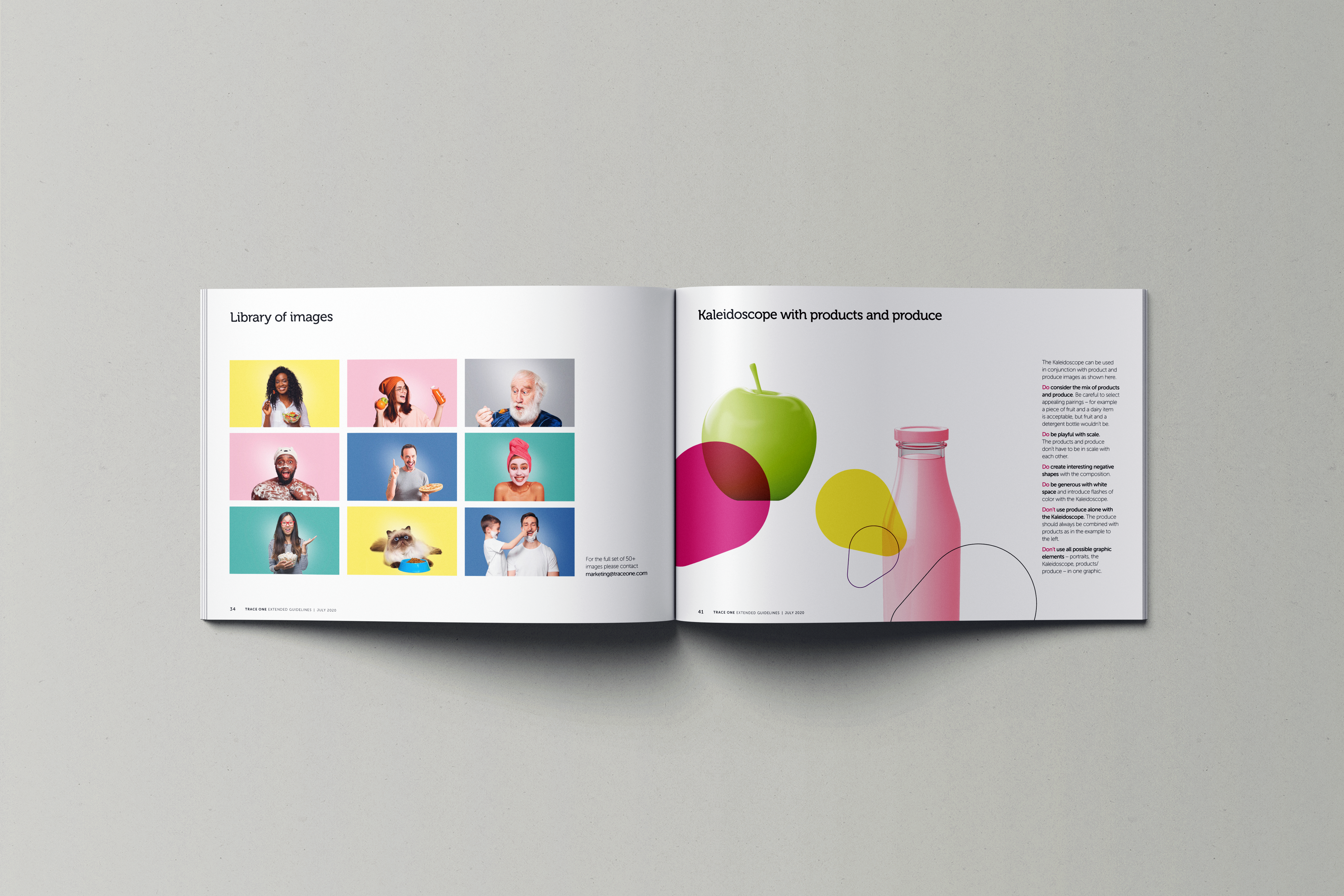
- The System: Color was given serious strategic structure. The corporate palette for company-level communications, and each product solution color-coded so they could be differentiated at a glance while still living inside the same brand. Typography, icon construction, photography direction, the Kaleidoscope usage rules — everything was documented with enough detail to remove guesswork.
- The Guidelines: The final brand book covered every scenario a designer or internal team would face — logo construction, exclusion zones, misuse rules, tone of voice, and application examples across print, digital, PowerPoint, Word, email, stationery, and exhibitions. The goal was simple: make it impossible to get wrong and easy to get right.
The Final Result
Trace One now has a brand system that holds together at scale. Whether someone is designing a DL leaflet for a trade show or sending an internal report, the brand stays consistent. The elements were always good. They just needed a system built around them.
- Client: Symphony Technology Group
- Category: Brand Guidelines, Brand Book Design
- Role: Lead designer, Brand Designer