TrustWrx
- About Project
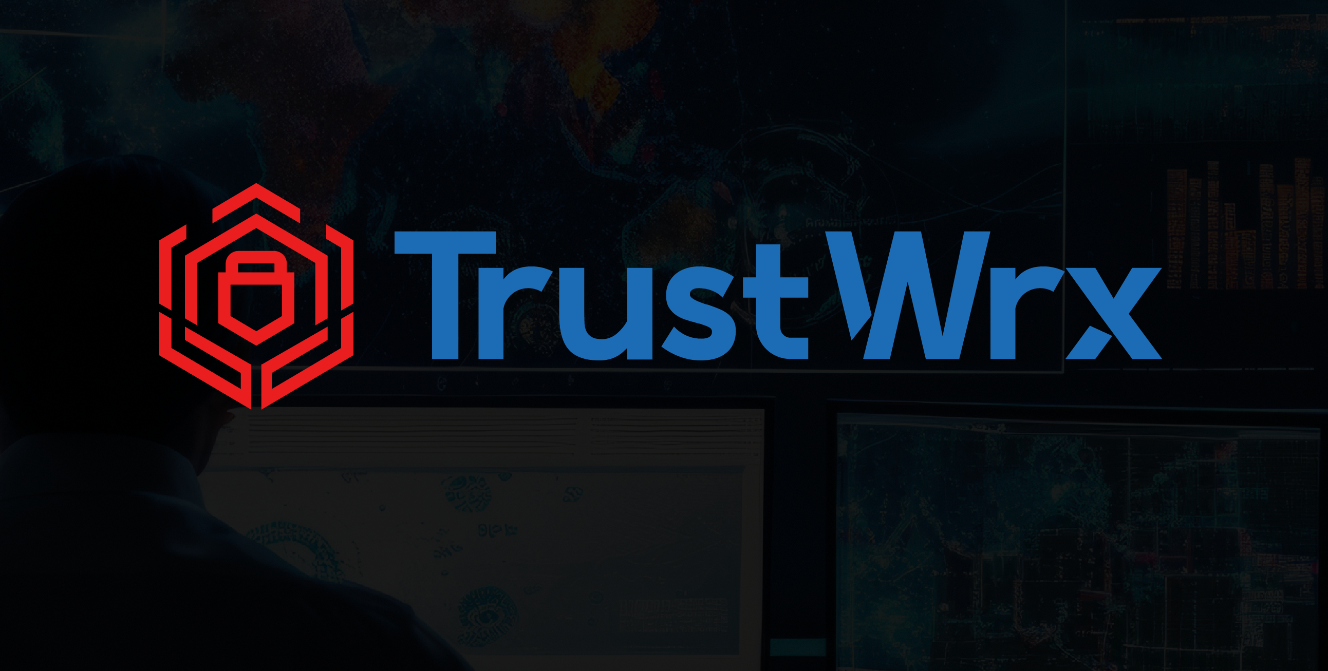
TrustWrx needed a logo that could carry weight in a trust and security focused space. The name says it all: trust, built through work. The identity had to reflect that without defaulting to the predictable shield and padlock visual language that saturates the category.
The Design Challenge
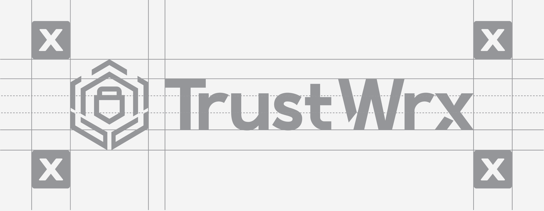
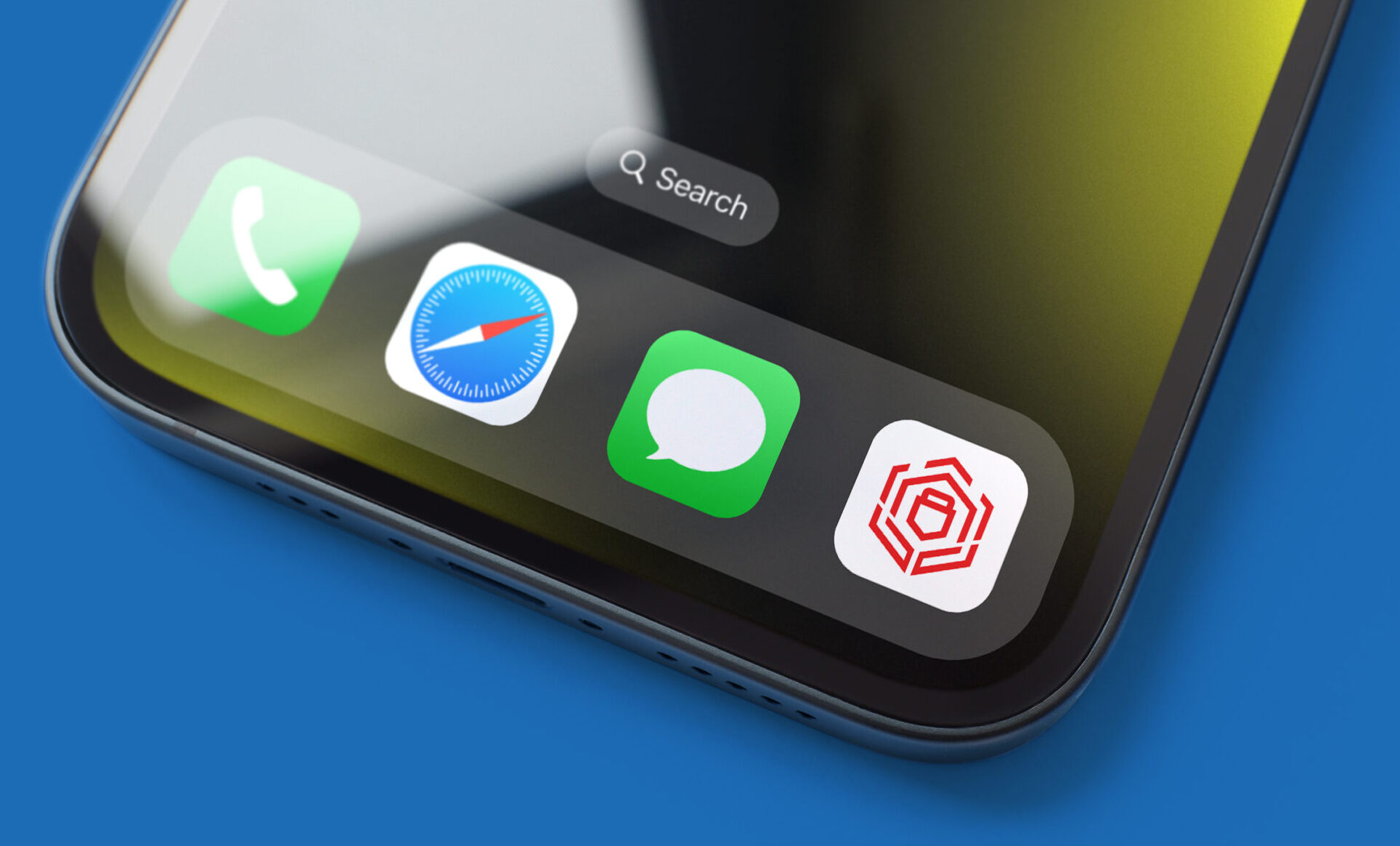
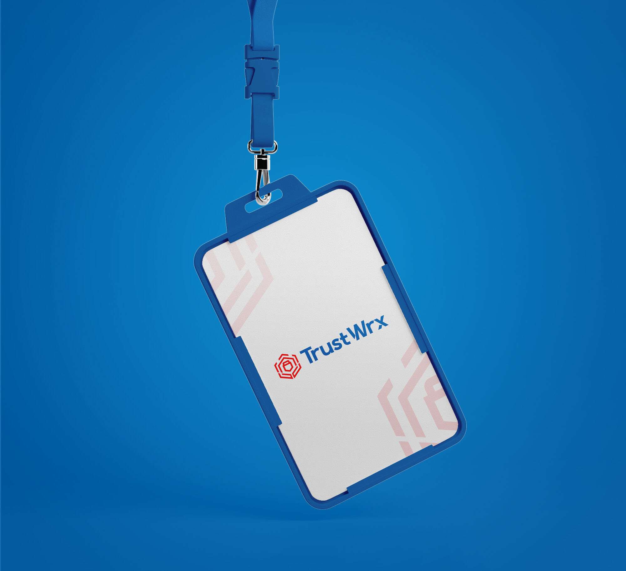
Designing for a brand built around trust means the mark itself has to feel credible from the first glance. Weak geometry, poorly balanced letterforms, or anything that looks unresolved undermines the brand before a single word is read. The logo had to feel engineered, precise, and confident enough to sit on a t-shirt, a phone screen, a laptop, and a lanyard card and hold its authority across all of them.
The Solution
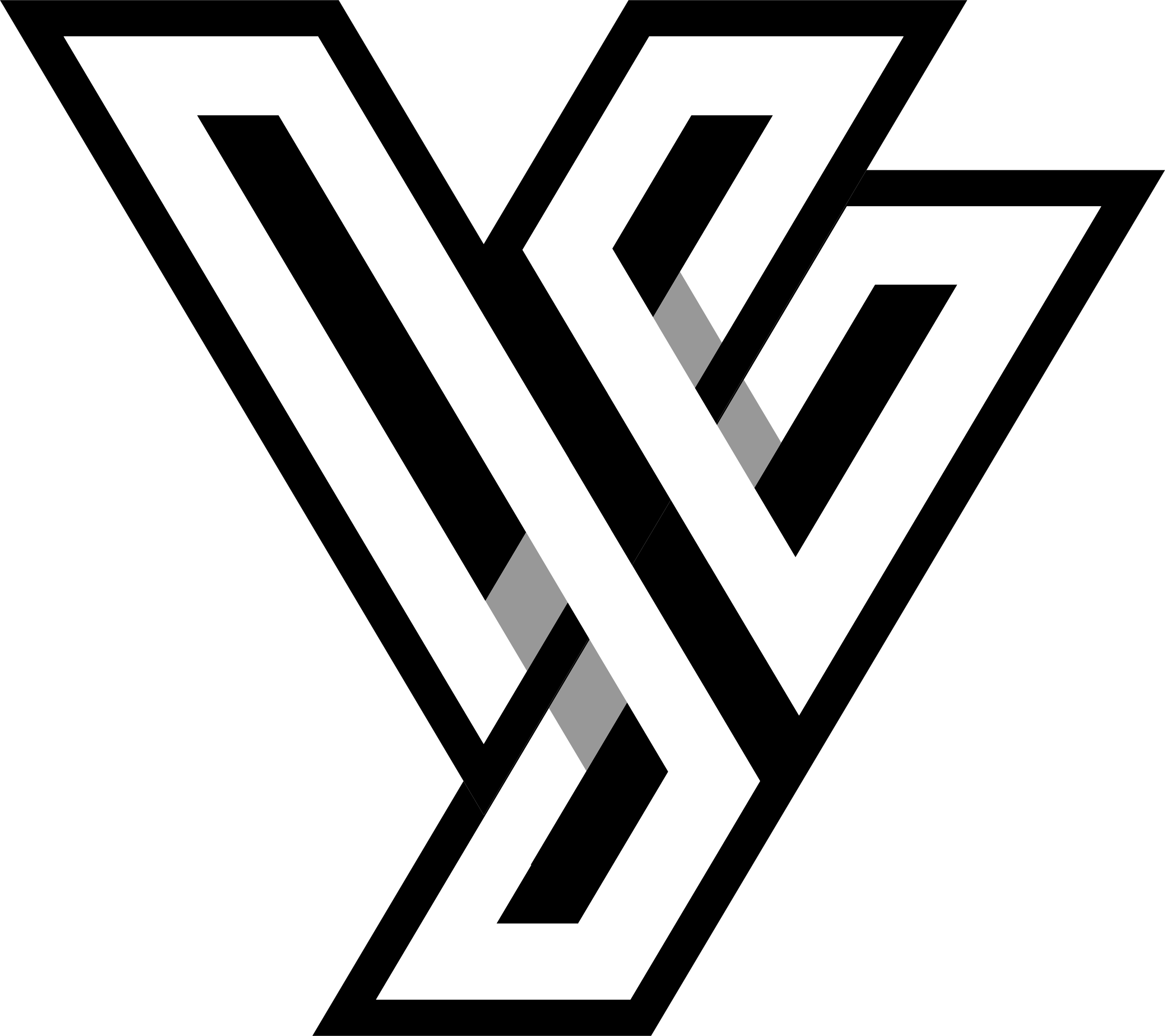
The Mark: The logo centers on a geometric hexagonal emblem with two layers of meaning built into it. The lower portion of the icon abstracts a hand, the human element of trust, holding and protecting what sits above it. The upper form represents a lock, the security layer. Together they communicate protection through human accountability, not just technology. The horizontal line cutting across the top introduces the digital dimension, a subtle signal that this is security operating in a connected, tech-driven world. Three ideas, one mark, no wasted geometry.
- The Wordmark: TrustWrx is set in a clean, modern sans-serif with tight spacing that matches the precision of the icon. The combination of the geometric mark and the confident wordmark creates a lockup that reads as a complete, resolved identity rather than two separate elements sitting next to each other.
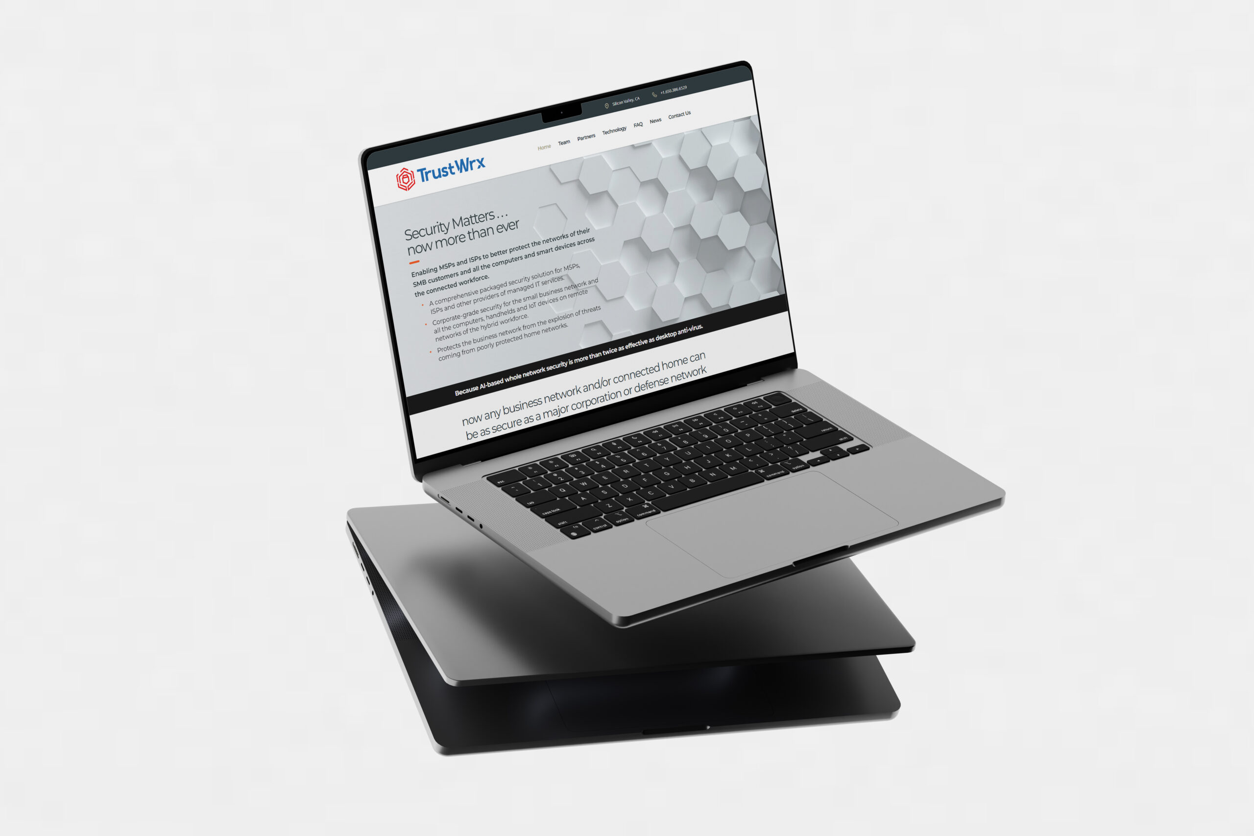
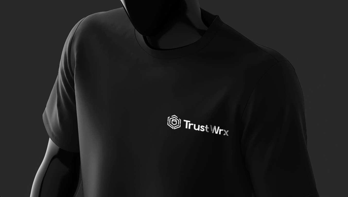
- The Application: The logo was tested across dark and light environments, on apparel, digital screens, and physical brand touchpoints. The red version on dark backgrounds carries energy and edge. The white version on black reads with quiet authority. The mark scales cleanly at every size without losing its structure.
The Final Result
TrustWrx has a logo that looks like it was built, not generated. The geometric precision of the mark, the tight wordmark, and the versatility across applications give the brand a foundation it can grow into confidently.
- Client: TrustWrx
- Category: Logo Design
- Role: Art Director, Designer