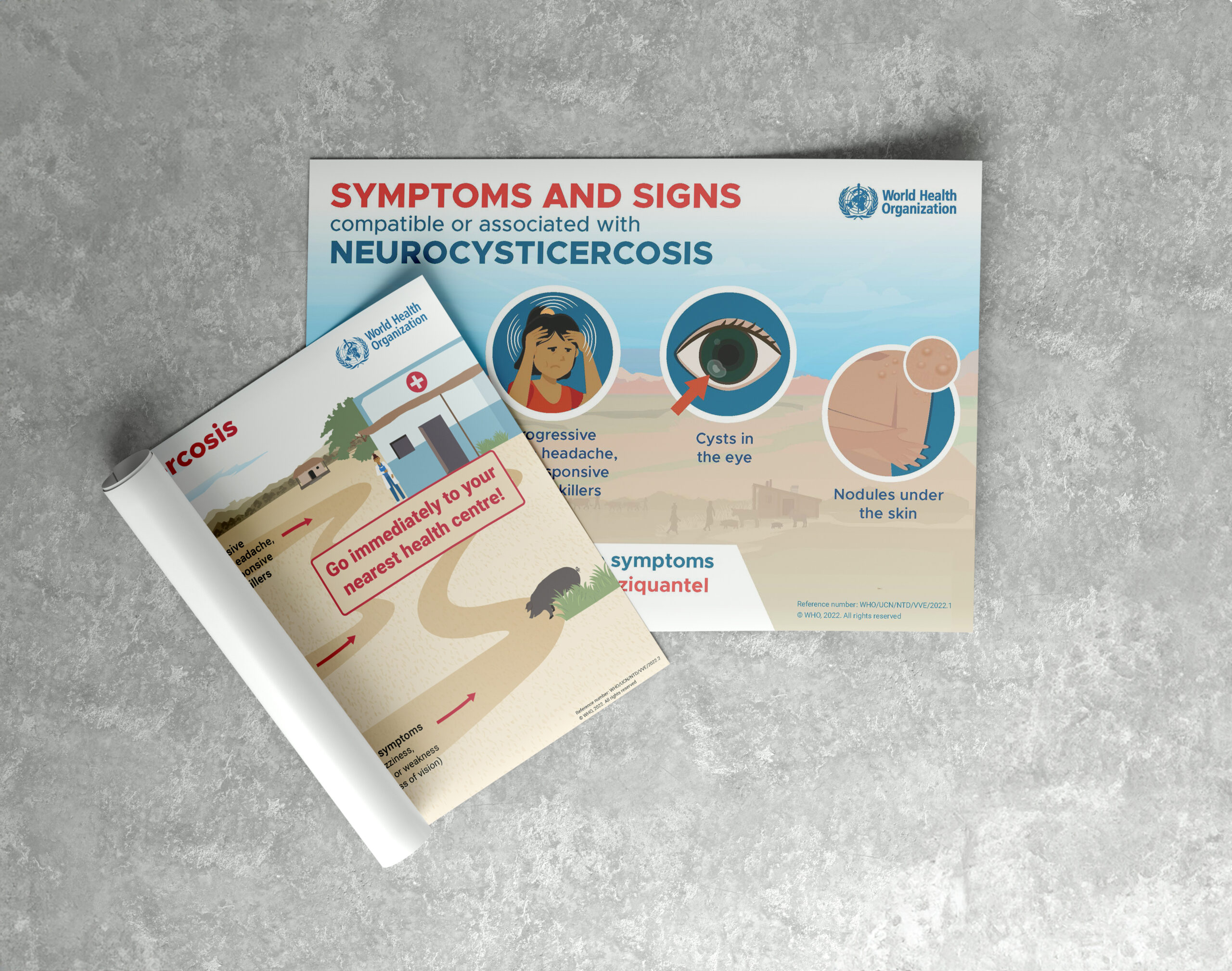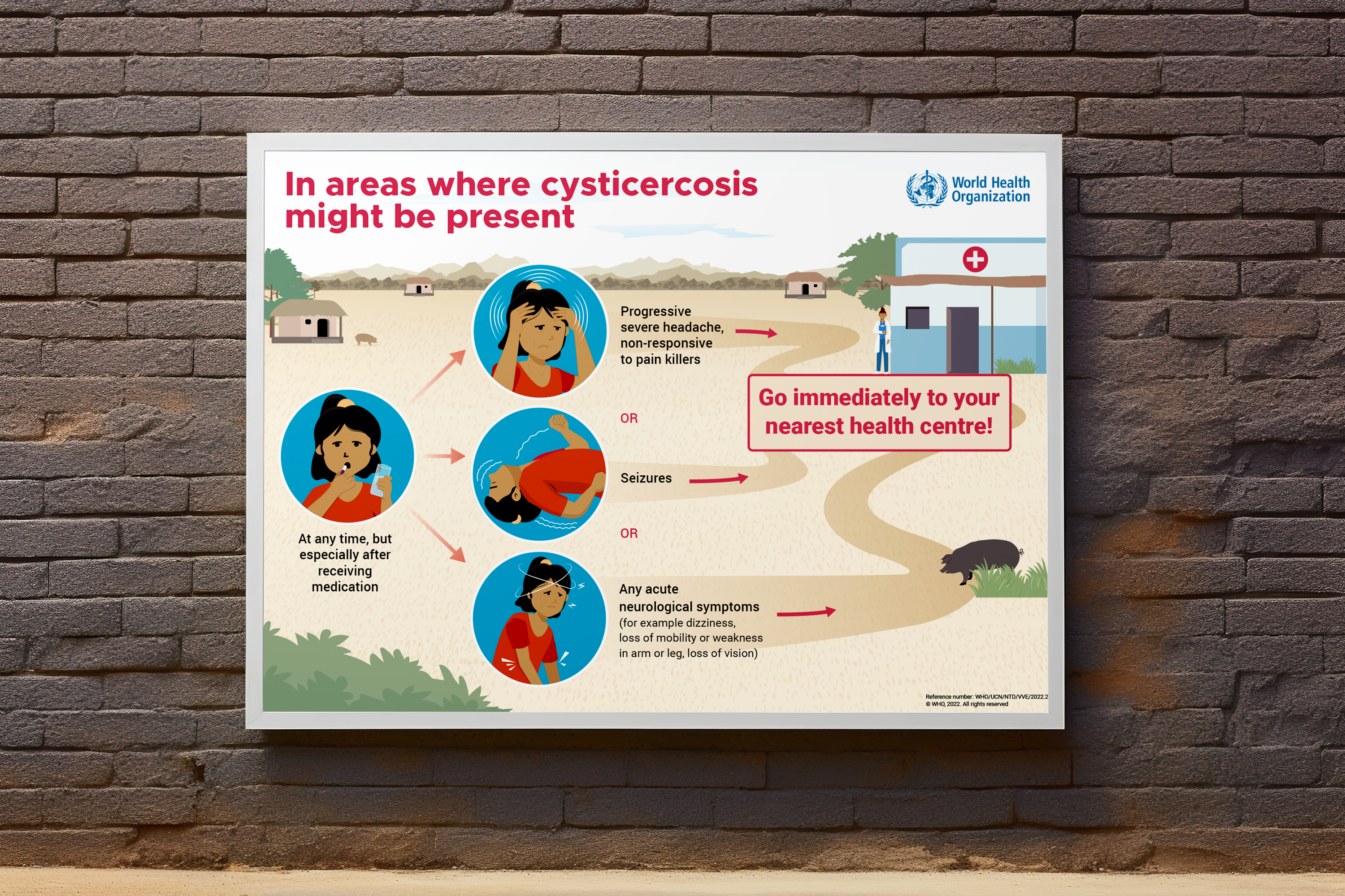
World Health Organization Poster
- About Project
The World Health Organization needed public health awareness materials for Neurocysticercosis and Cysticercosis, parasitic diseases that affect communities in low and middle income regions. The posters had to communicate critical medical information to populations where health literacy cannot be assumed and access to doctors is limited. Getting the message wrong, or making it too complex, had real consequences.
The Design Challenge
This was not a branding brief. It was a communication brief with lives attached to it. The posters needed to work for audiences who may not be fluent readers, in regions where the nearest health centre could be miles away. Every visual decision had to serve clarity. Symptoms needed to be instantly recognizable. Instructions needed to be followable without explanation. The WHO identity had to be present and trusted without overwhelming the message.
The Solution
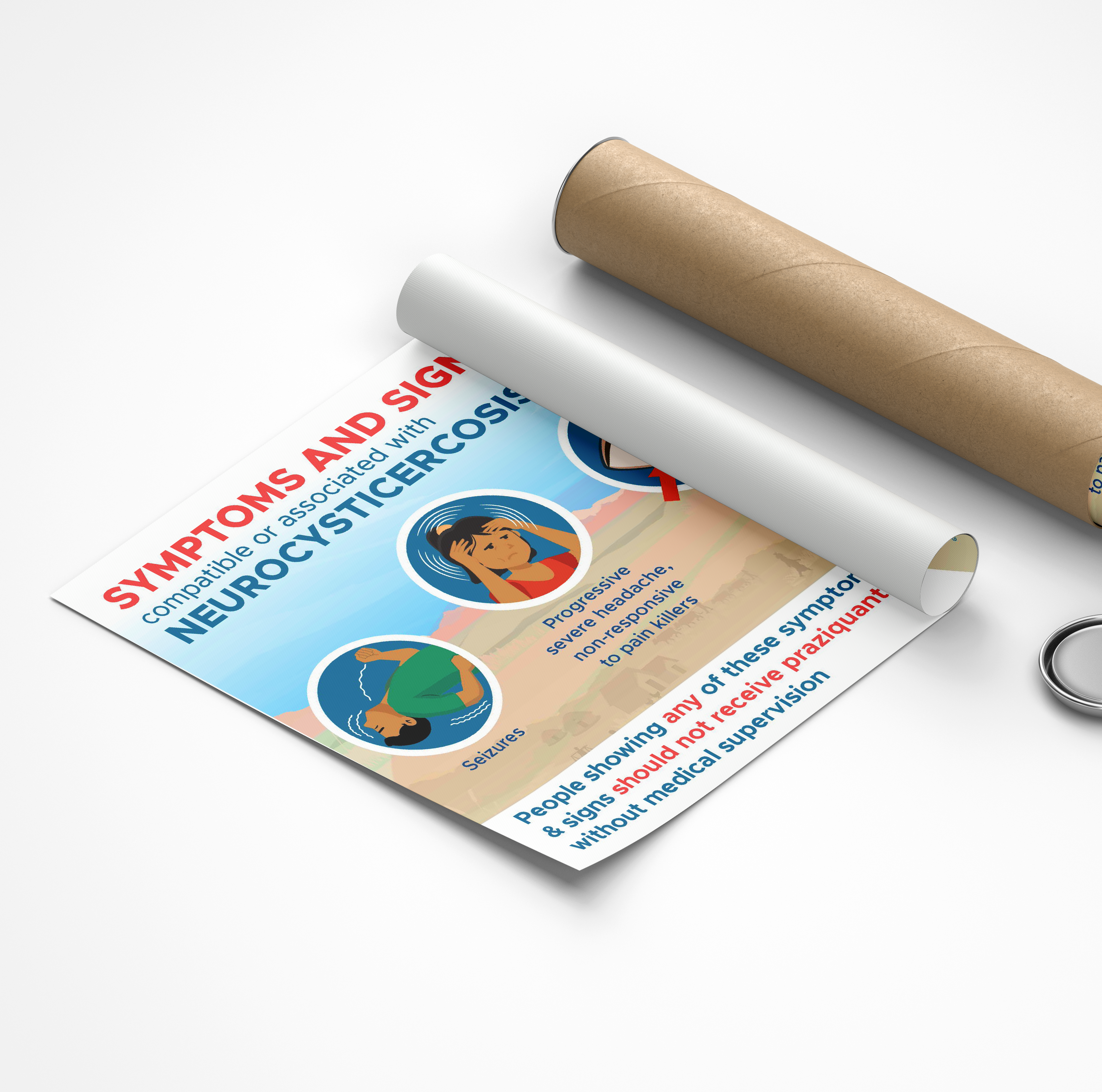
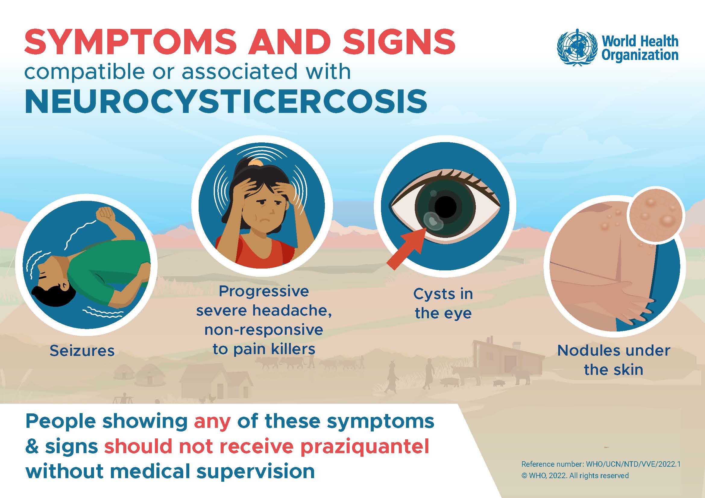
The Visual Approach: The design used illustrated figures and clear iconography to depict symptoms including seizures, severe headaches, cysts in the eye, and nodules under the skin. Illustrations were chosen over photography deliberately. A drawn figure is universally readable across cultures and literacy levels in a way that clinical photography is not.
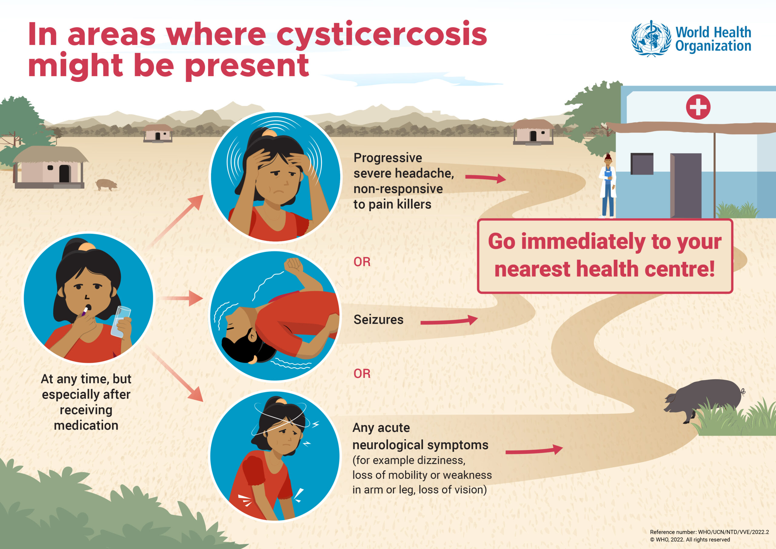
- The Information Hierarchy: Two distinct posters were designed for two distinct jobs. One focused on symptoms and signs of Neurocysticercosis for clinical or community health settings. The other was a field-facing awareness poster directing people in areas where Cysticercosis might be present to go immediately to their nearest health centre if they experienced symptoms. Each poster had one primary message and everything else supported it.
- The Accessibility: Color, layout, and language were all calibrated for maximum clarity at a glance. The red and blue palette kept the visual language urgent but legible. The illustrated scenes showed real environments, rural paths, health centre buildings, recognizable domestic settings, so the audience could place themselves in the context immediately.
The Final Result
Two WHO posters designed to be understood by anyone, anywhere, at a single glance. The work sits at the most serious end of what design can do: not selling something, not building a brand, but making sure the right information reaches the right person at the right moment.
- Client: World Health Organization (W.H.O)
- Category: Poster Design, Health Communication
- Role: Illustrator, Visualizer